Tripster
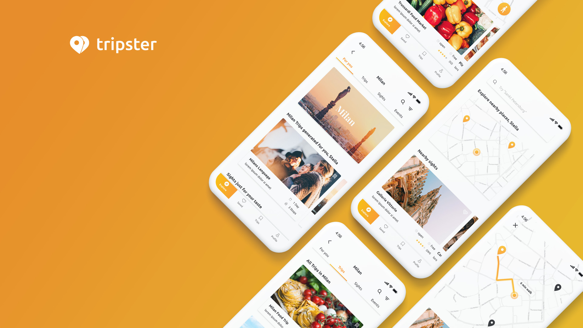
An approach to an all in one travel app
Timeline
4 Weeks
November - December 2019
Project type
Personal Project
My role
UX Design
Tools
Adobe Suite
InVision Studio
Skills
UX Research, UX Concept, UX Design, Interaction Design
Outcome
wireframe concept, interaction prototype, and visual design
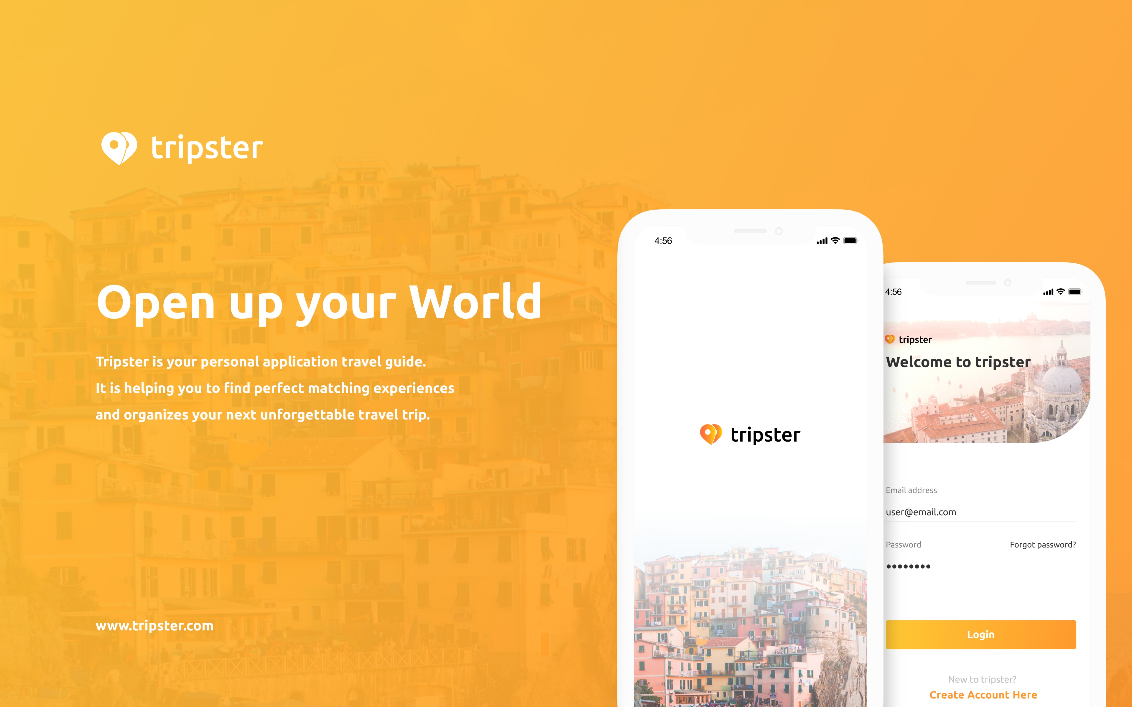
Tripster is a personalized
travel guide application
01 Overview
I'm really passionate about traveling and wanted to dig deeper into Invision Studio. That's why I decided to work for fun on Tripster as a personal project. Tripster was designed as a self-learning travel guide. The main goal was to create an all in one travel companion, which would enhance the trip organization process with truly personalized travel recommendations.
What should we do now?
Being in a foreign place
02 Problem
After my graduation, I've been over a month in China for a mandarin course. During my free time, I ran into the problem, that I was in a foreign country with endless sightseeing options, but didn't know which ones would fit my interests. As always I then decided to go for the top attractions, which were sometimes very crowded. I wondered if there is a way to enhance the travel experience and decided to work on a personalized travel guide.
Just as a tip - don't plan a shanghai trip during golden week
The way to go
User-Centered Design
03 Process
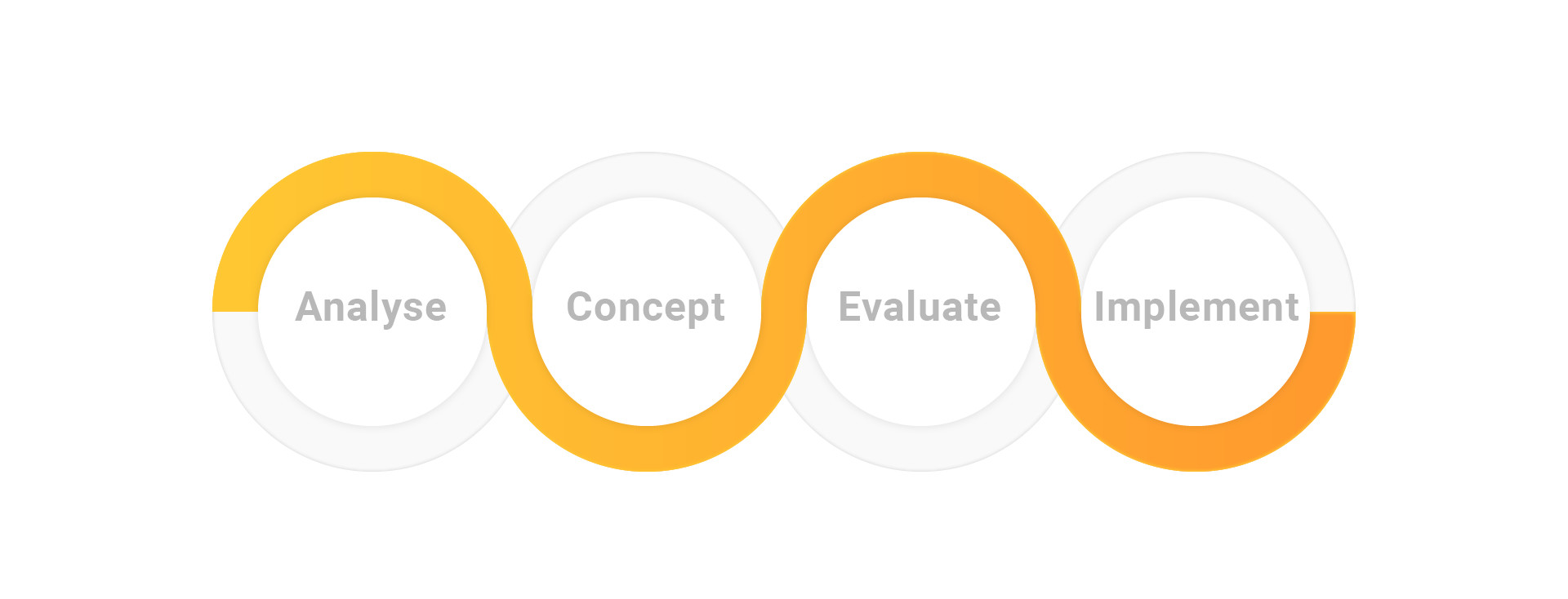
The development of tripster is based on the user-centered design process. It is an iterative design process for interactive systems. It put's the future users at the center of the project and designs the system around their specific needs.
Building the foundation
Research and Analysis
04 Analysis
The analysis phase intended to uncover the needs and frustrations of the user. I conducted a competitive analysis of tripster's direct competitors in the travel application industry. Additionally, I held four qualitative user interviews and created an affinity map of their key responses to organize and synthesize them.
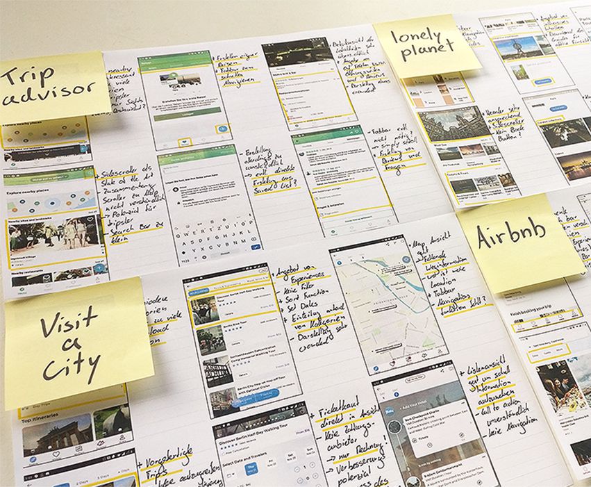
Competitive analysis
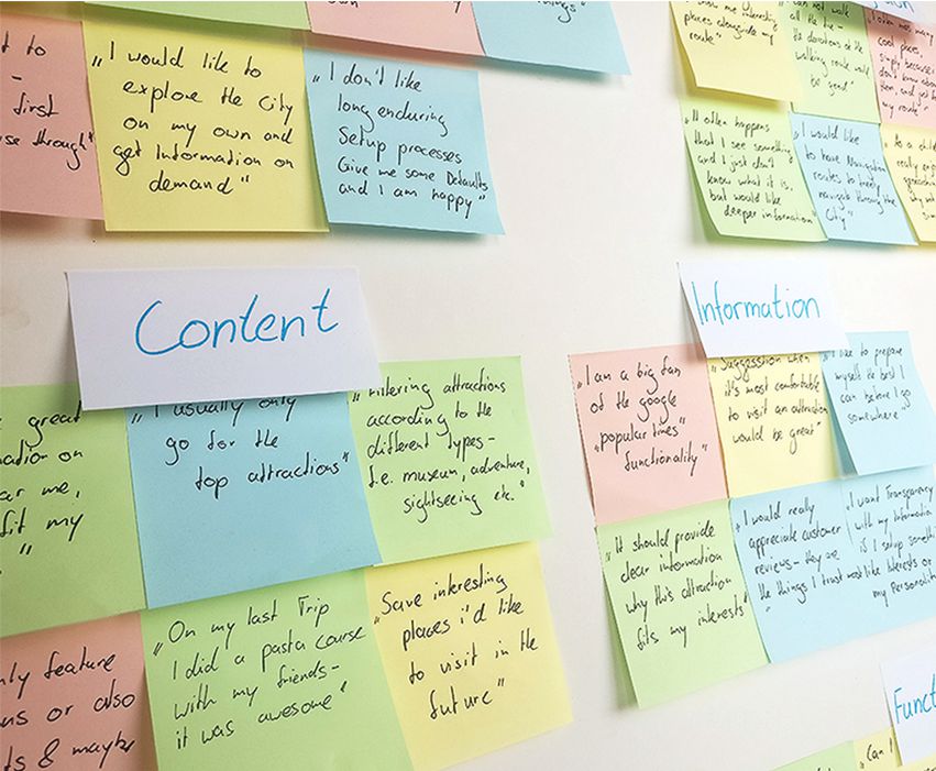
Affinity map of interview responses
What the Fact
Analysis Insights
After conducting the user interviews and analyzing the gathered data, I was able to categorize the insights into these 3 categories.
Personalization
- • Personalized recommendations
- • Interests & location-based suggestion
- • Inspirations to broaden the horizon
- • Personalized and predefined city trips
- • Possibility to explore on their own
Accessibility
- • Easy and intuitive handling
- • Include sights, events & restaurants
- • Include navigation & route information
- • Options to buy tickets and skip lines
- • Bookmark and save places
Reliability
- • Provide reliable & updated information
- • Provide download/offline functionality
- • Provide preparation guides
- • Include customer reviews
- • Include multiple languages
Finding a way
Creating an idea
05 Ideation
Creating the main user persona helped me to make decisions about defining, prioritizing and personalizing content and features for the users. Furthermore, it was important to create an end to end information architecture and real-life use-cases, on which the upcoming usability tests are based upon.
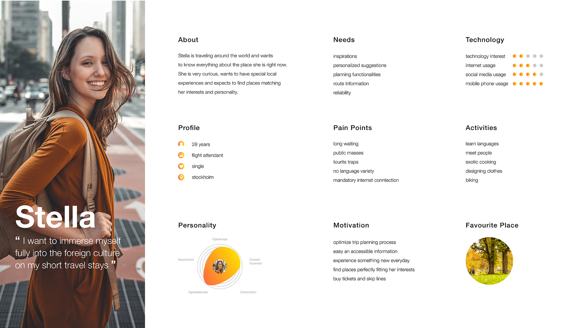
Persona Stella
Information architecture
Use case diagram
Let's get it started
Building the concept
06 Conception
After brainstorming and scribbling out the first ideas, I started off with pen and paper and created low-fidelity wireframes. Reviewing everything in quick paper prototyping sessions allowed me to explore and evaluate different ideas in a short time. I digitalized everything and created the use-case wireframes. Finally, I put everything together in the first click prototype.
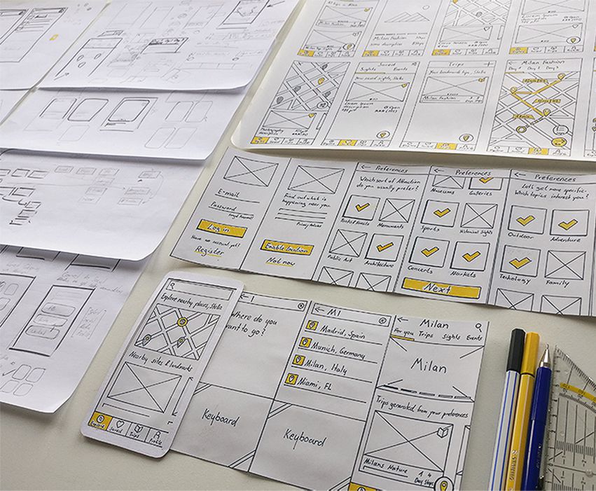
Scribbles and paper wireframes
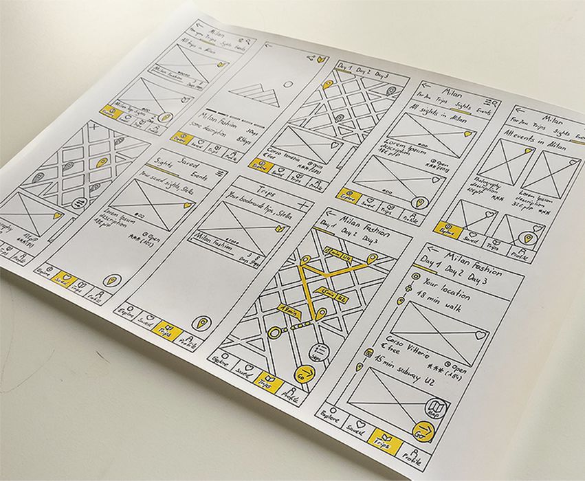
paper wireframes
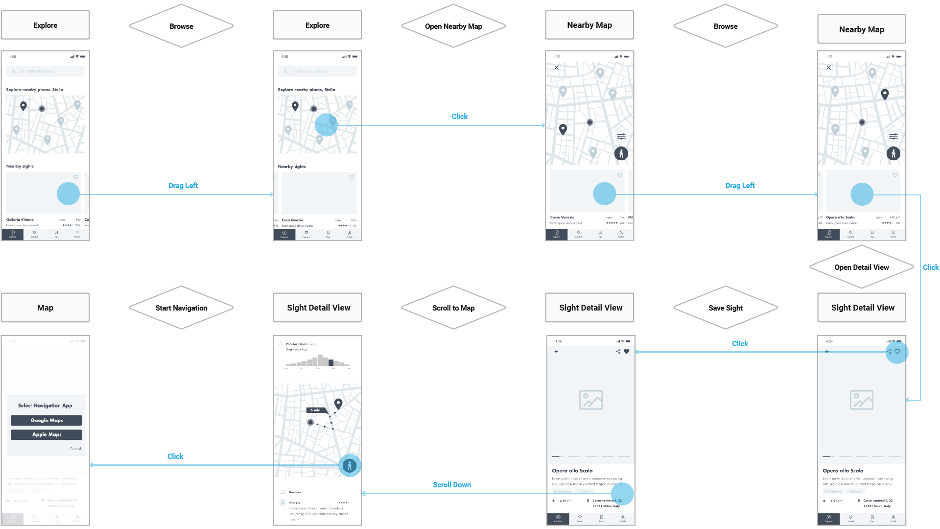
Explore nearby use case as wireframe flow
Profile setup
Explore nearby sights
Search for an event
Ask the users
They know best
07 Evaluation
I asked 4 participants to test the prototype's usability. They were given three different scenarios, each with one use case to complete. The participants should use the thinking aloud method and were recorded throughout the test. The main goal was to identify potential problems, receive qualitative user feedback and gain valuable insights for further development.
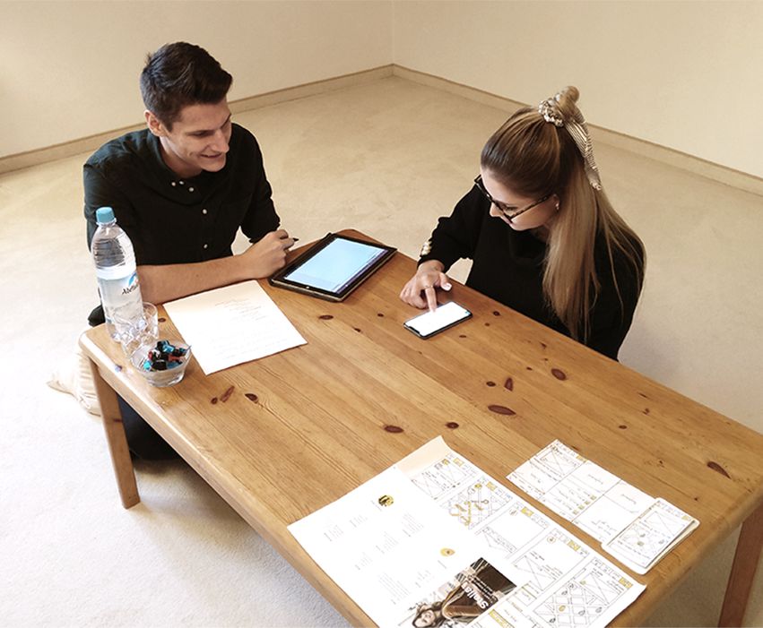
usability testing
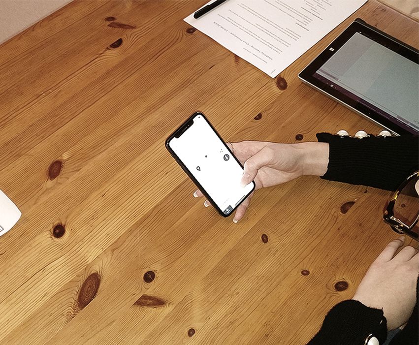
usability testing - interaction prototype
Let's put it together
Creating the visual design
09 Design
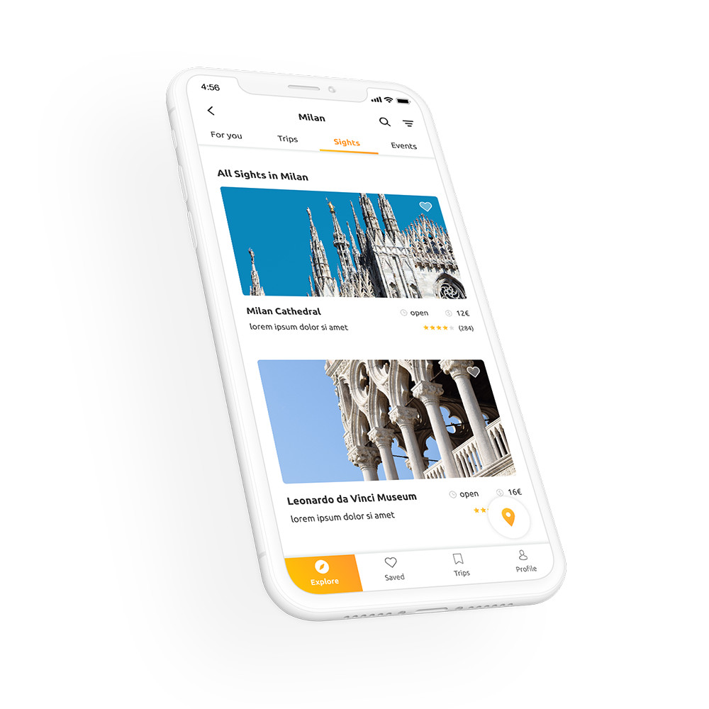
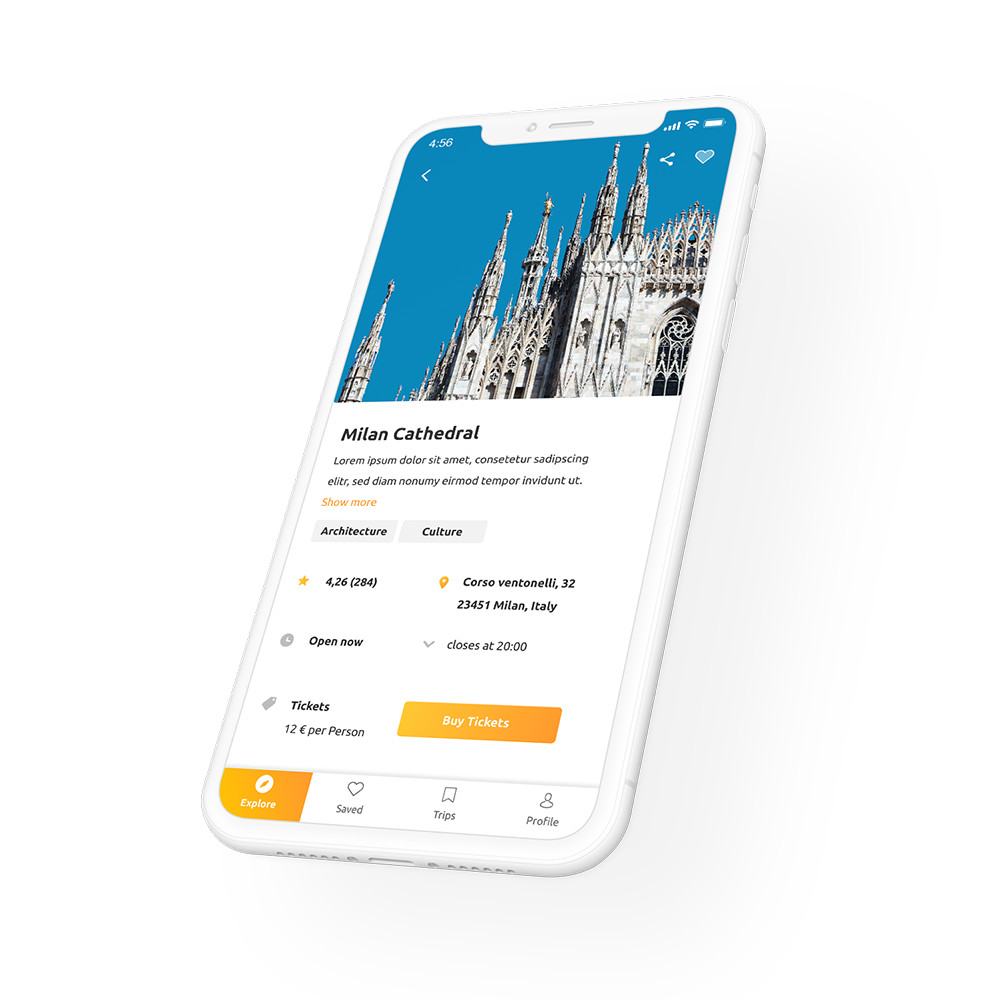
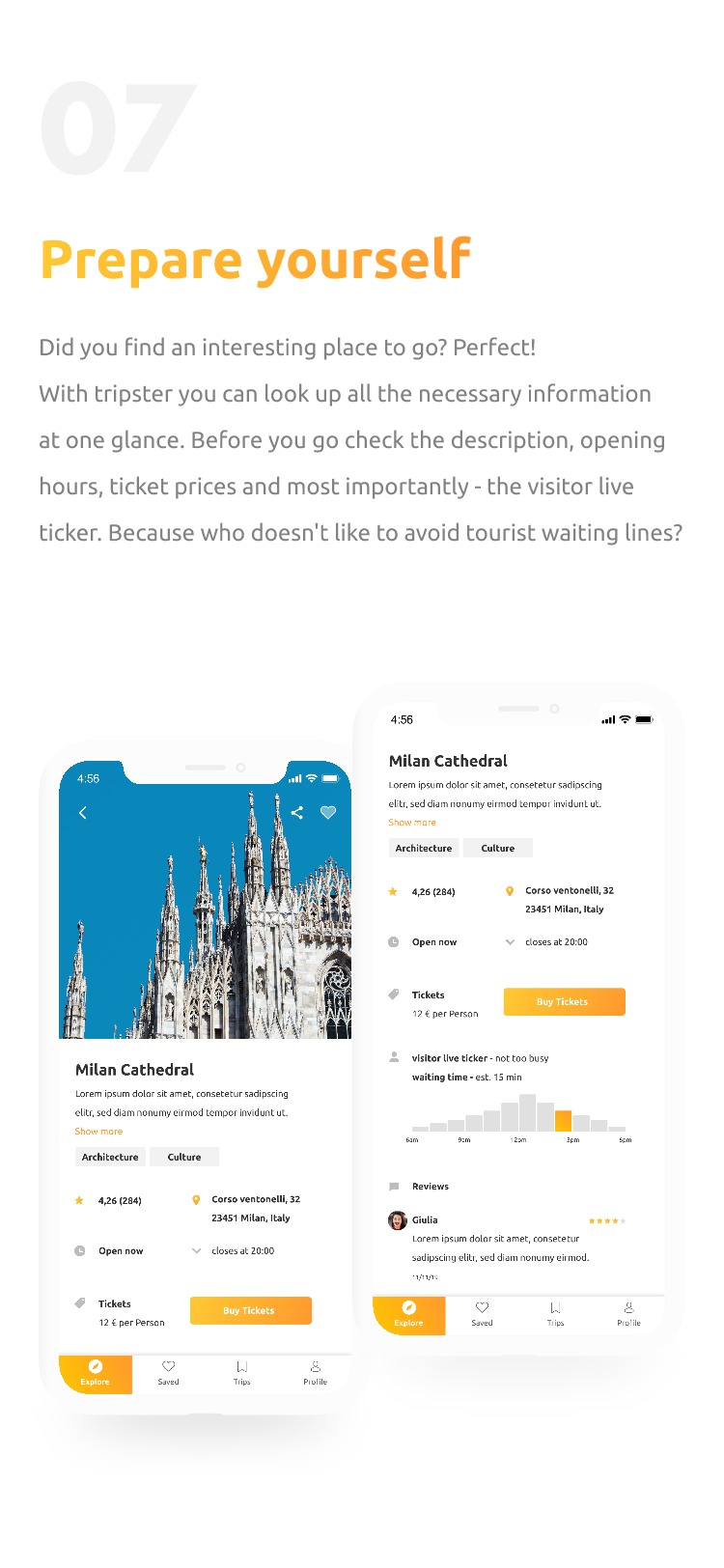
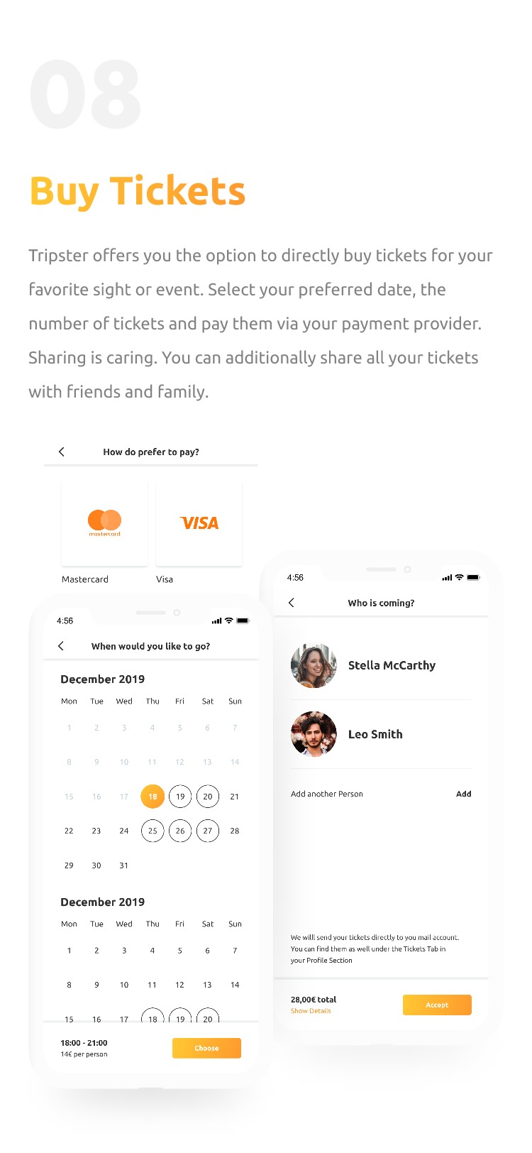
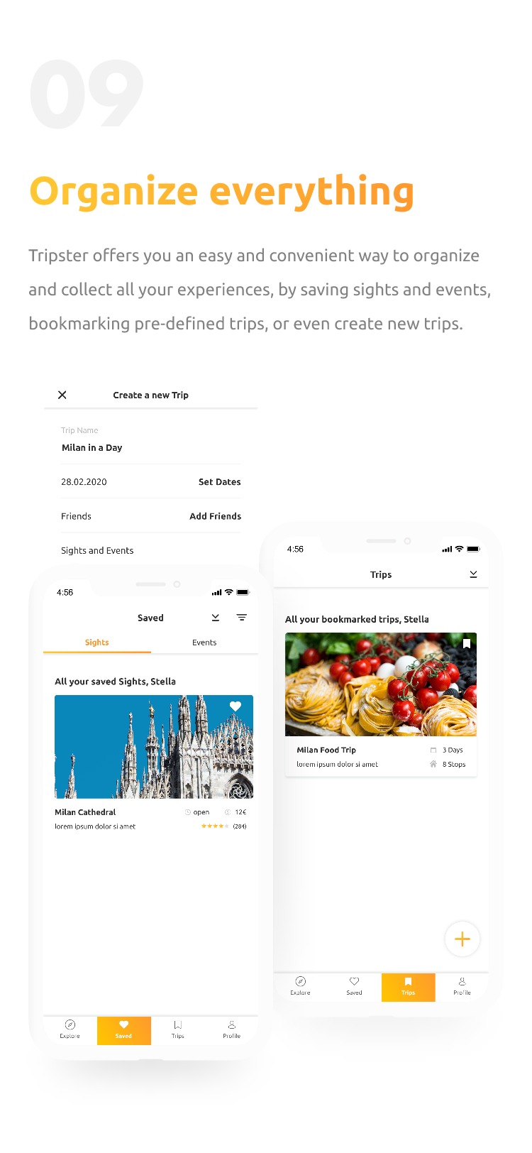
After refining the wireframes according to the user feedback, I began thinking about how the tripster application would look and feel. I created mood boards with different tripster brand wordings, design influences, and interfaces. The goal was to shape the first idea in which way the design is heading. After several iterations, I fleshed out the style guide, visually designed several screens and created a motion example within Invision Studio.
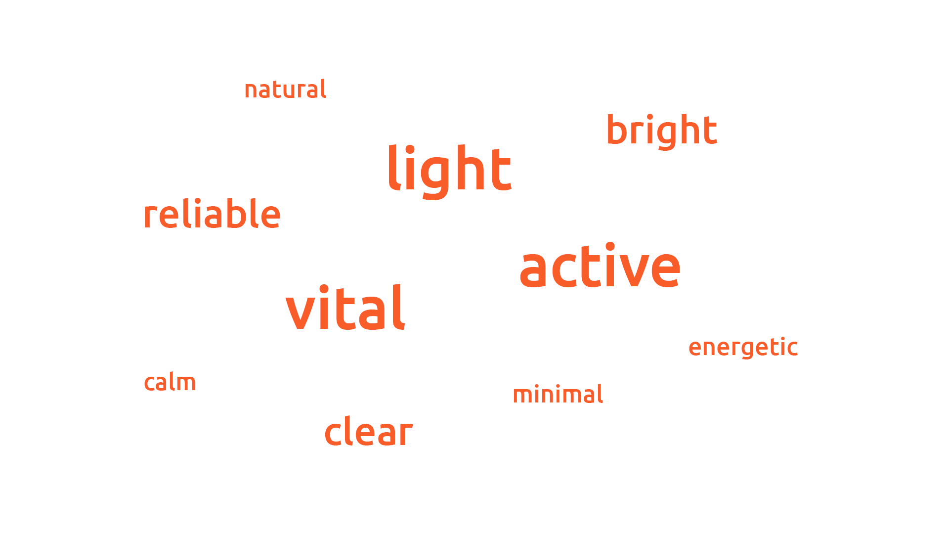
Mood adjectives
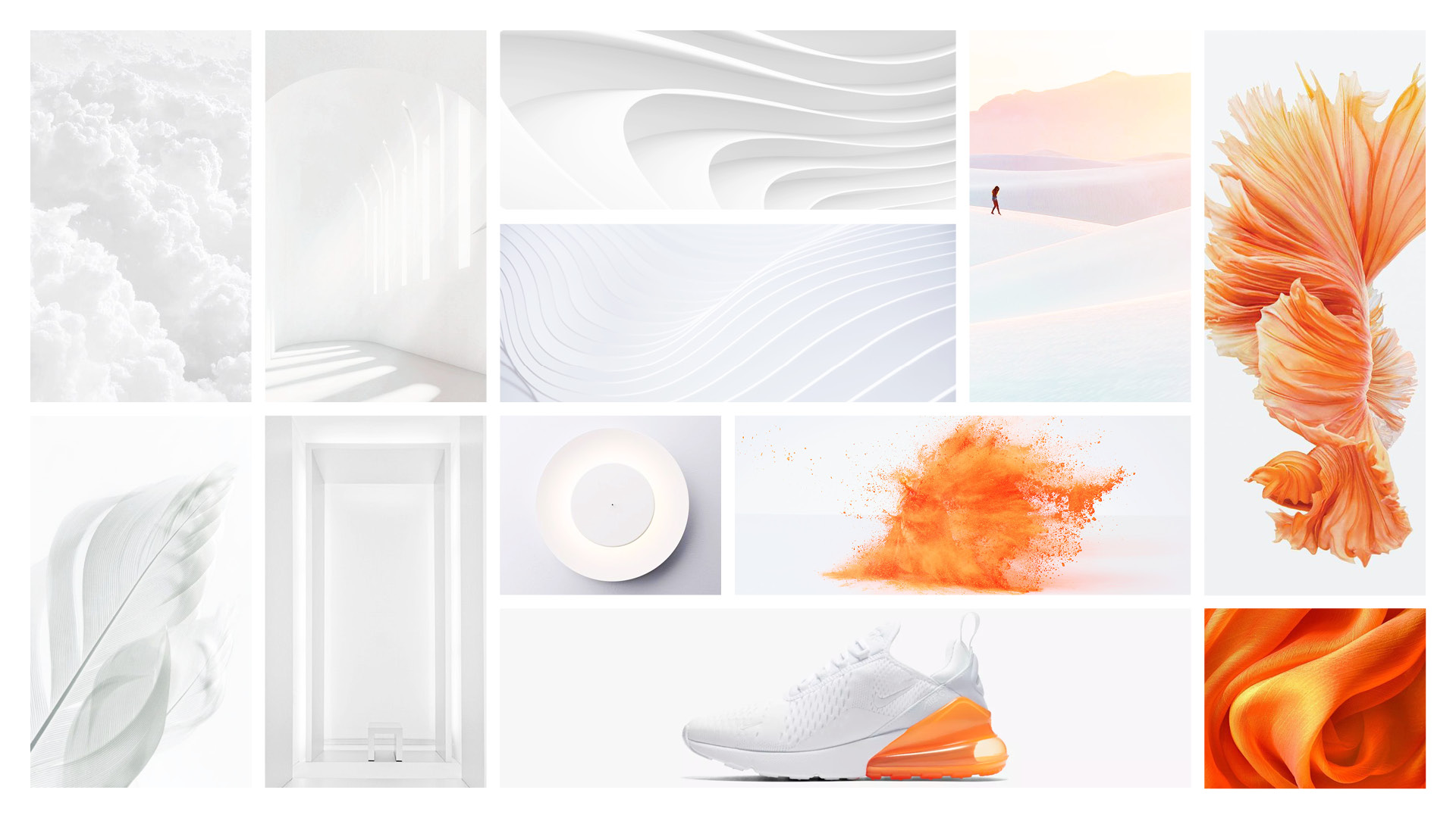
Mood references
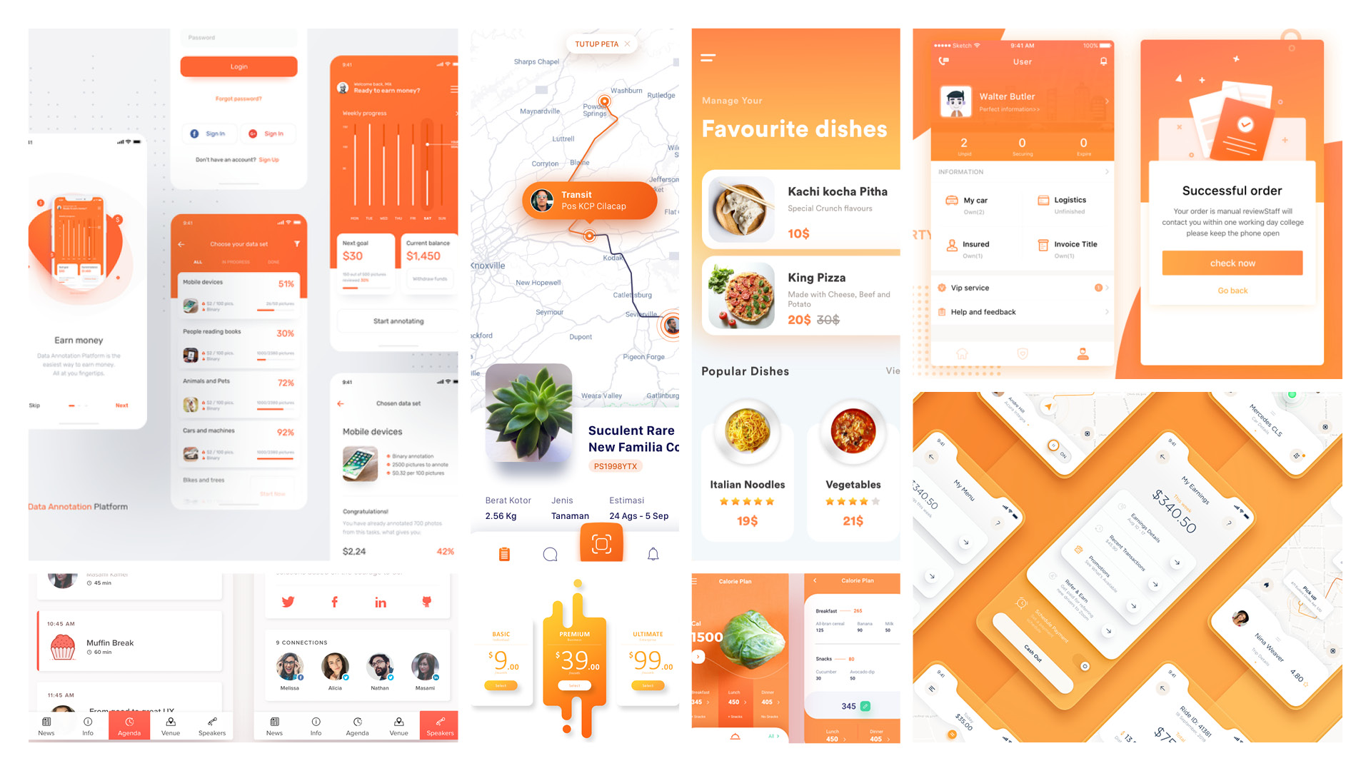
Mood interfaces
Presentation time
Final result
10 Results
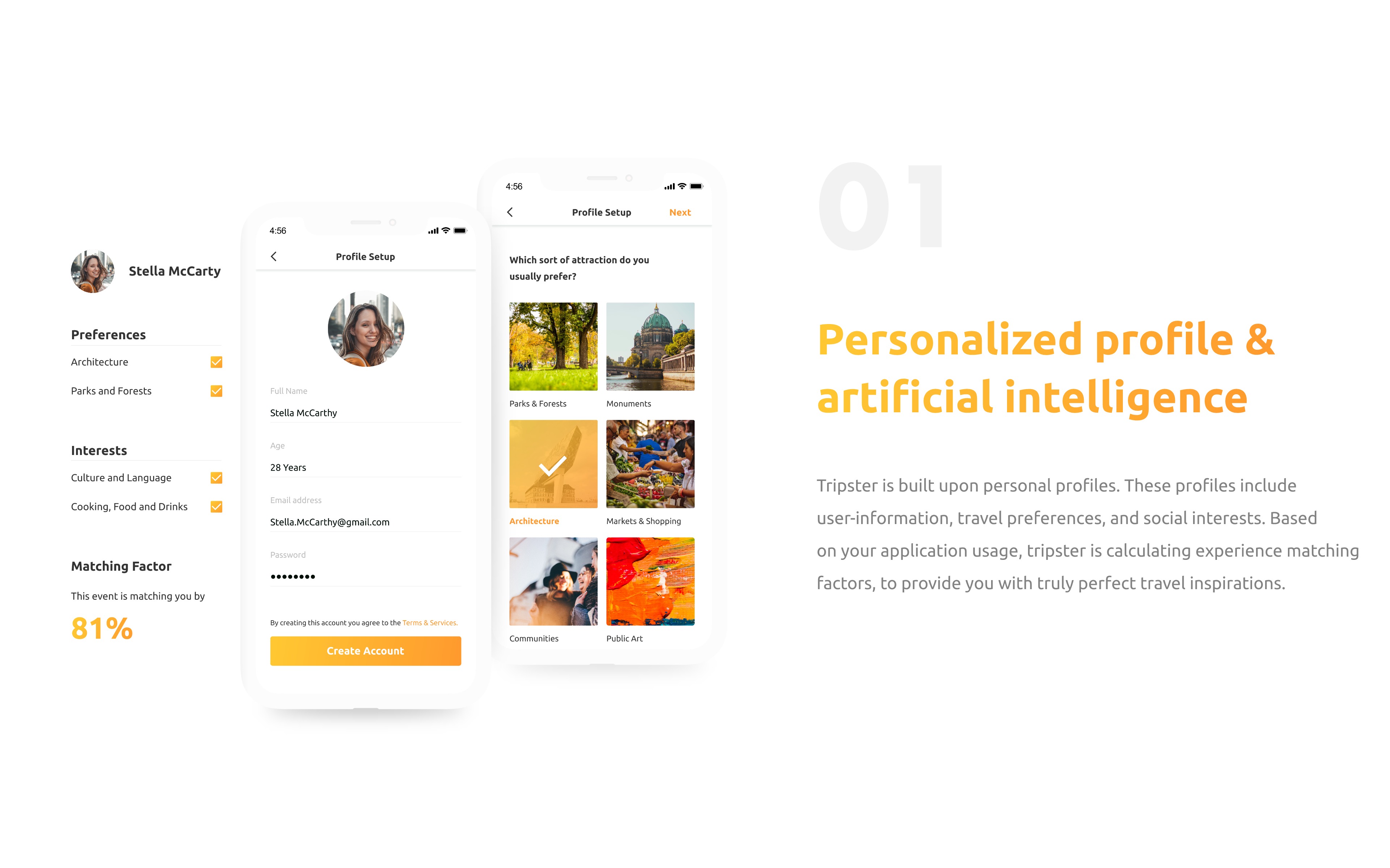
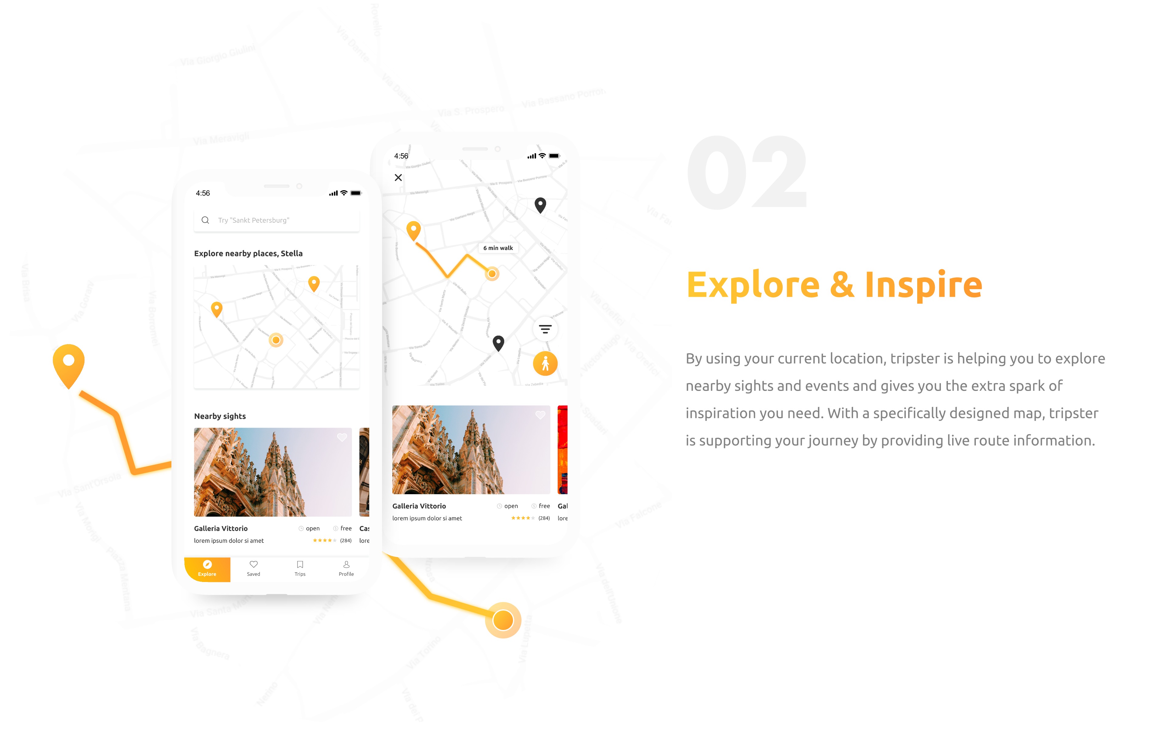
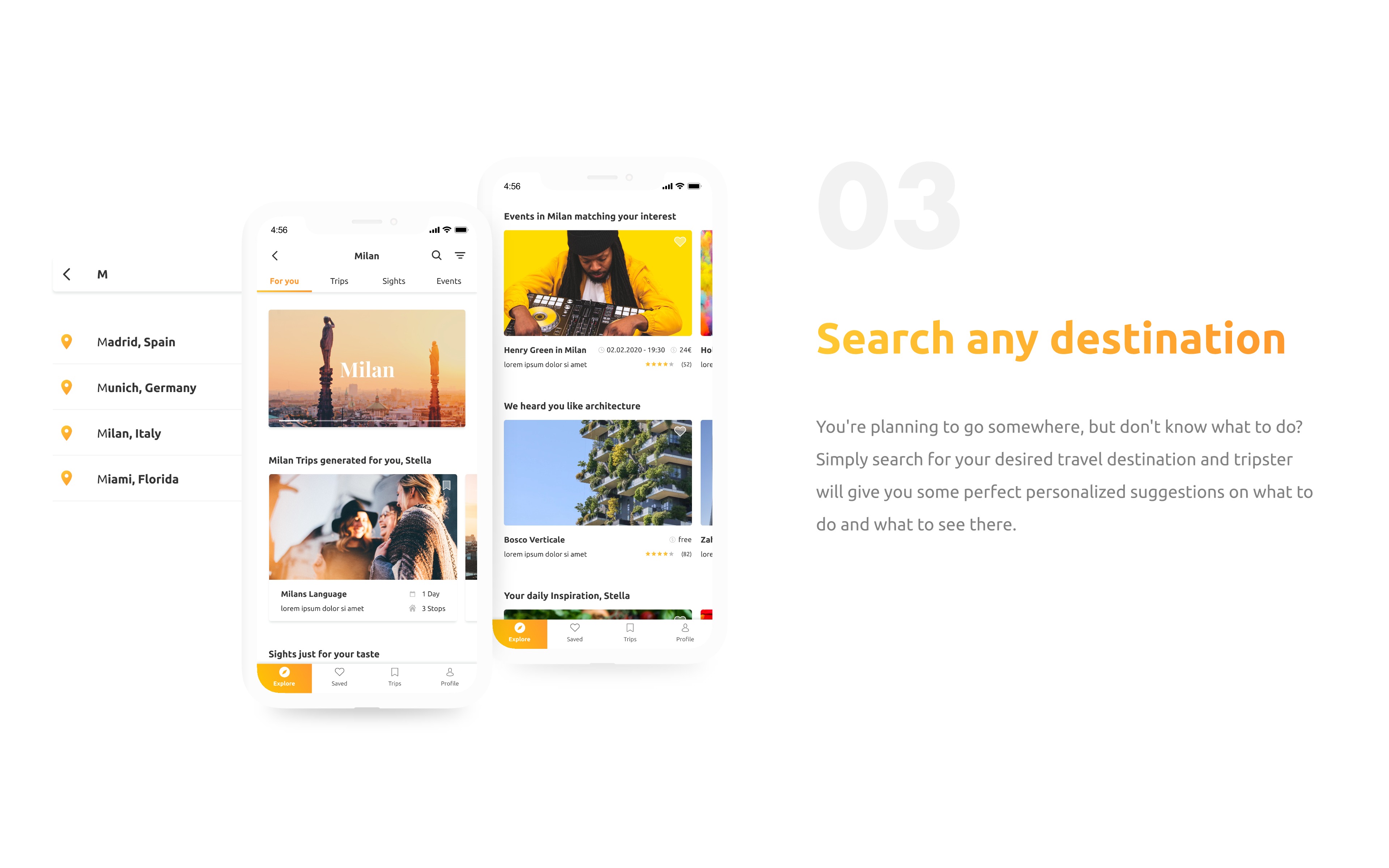
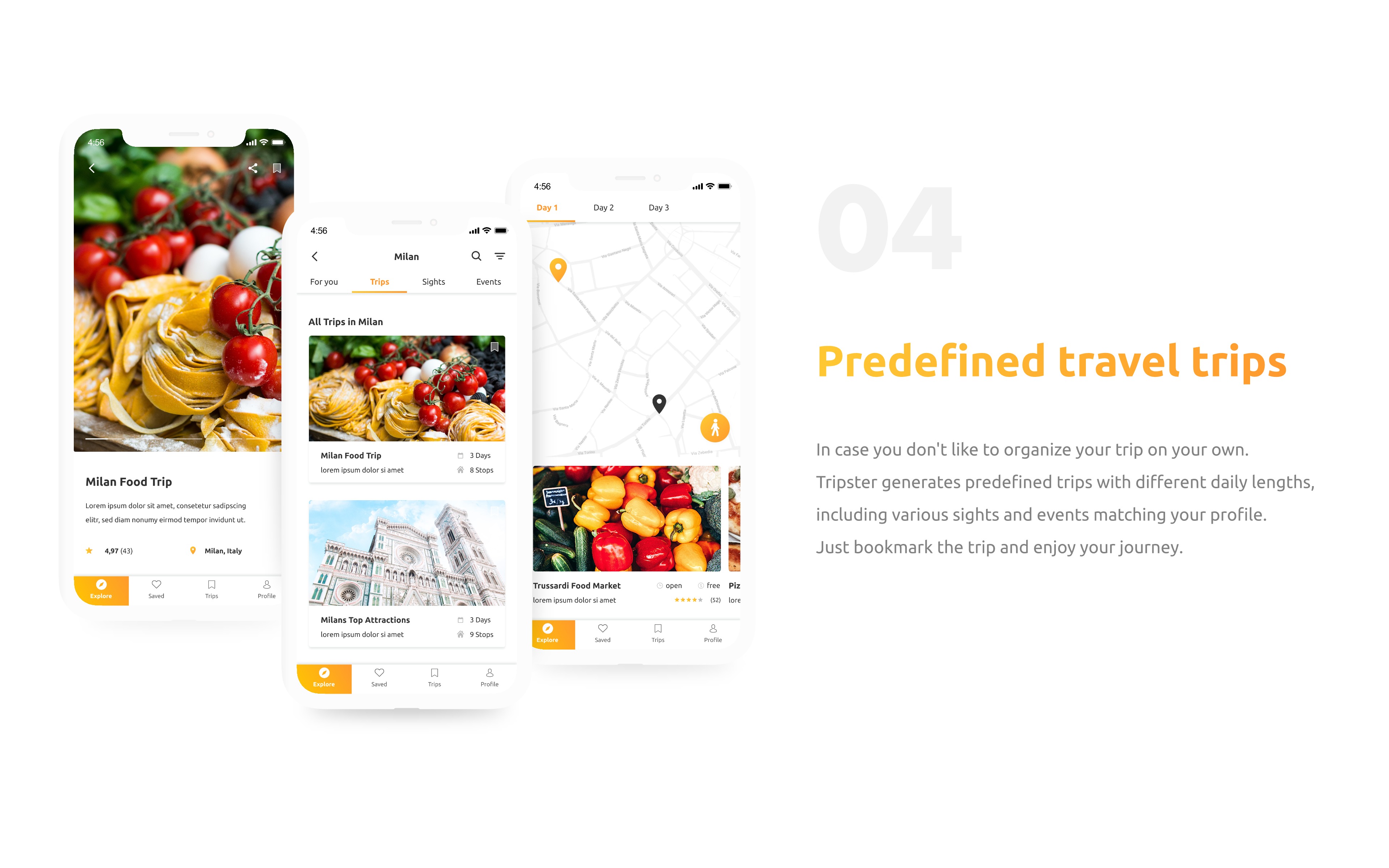
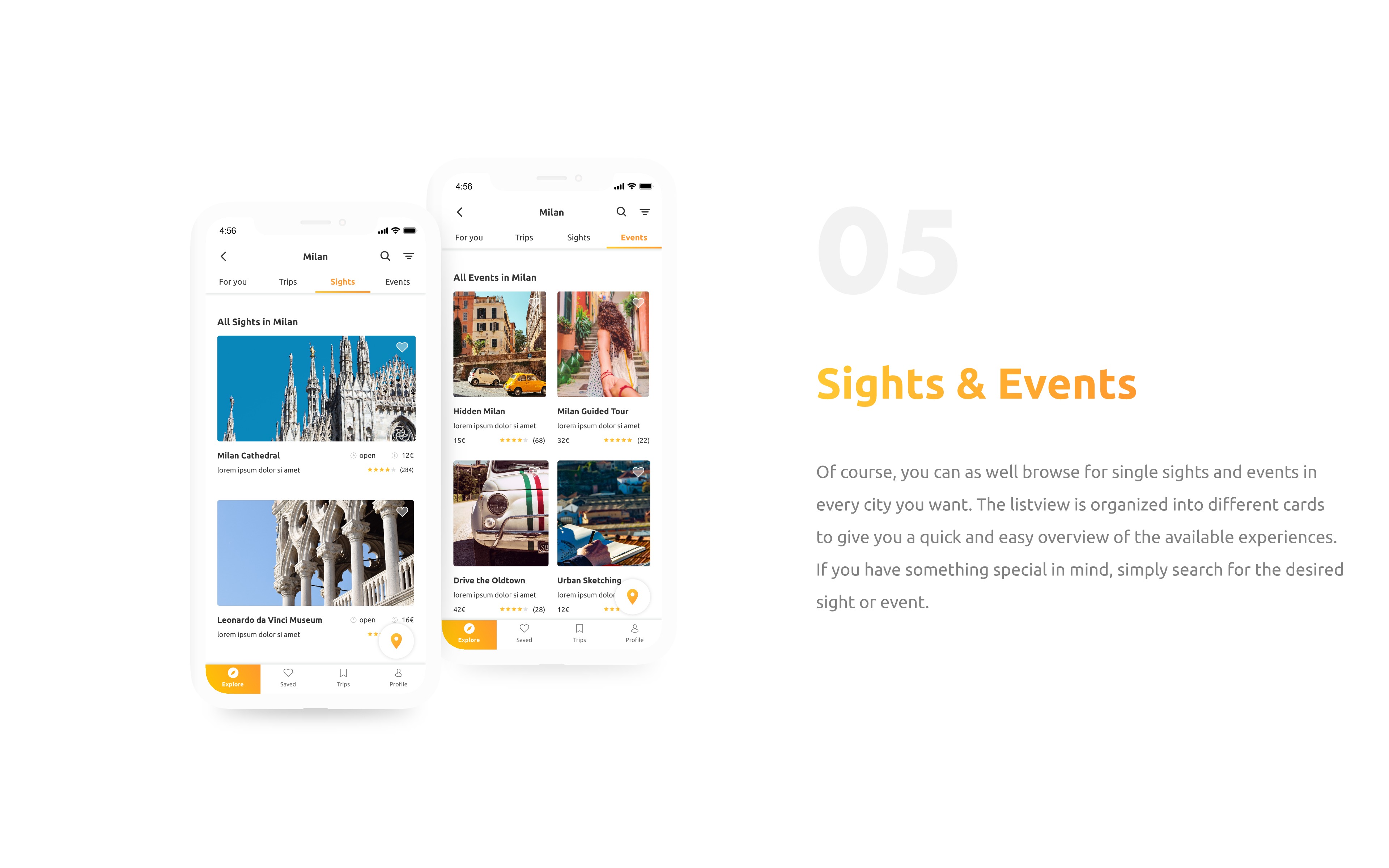
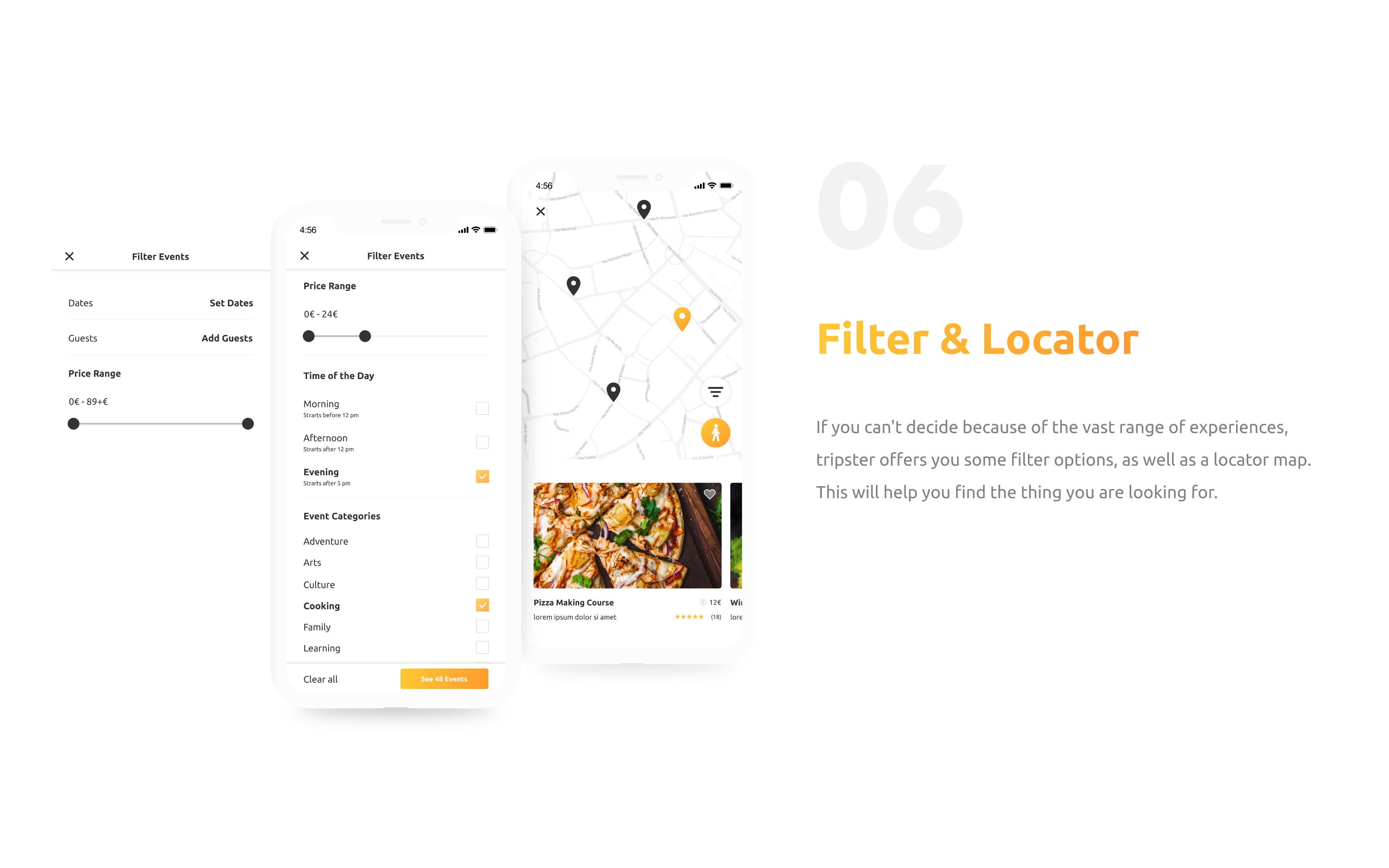
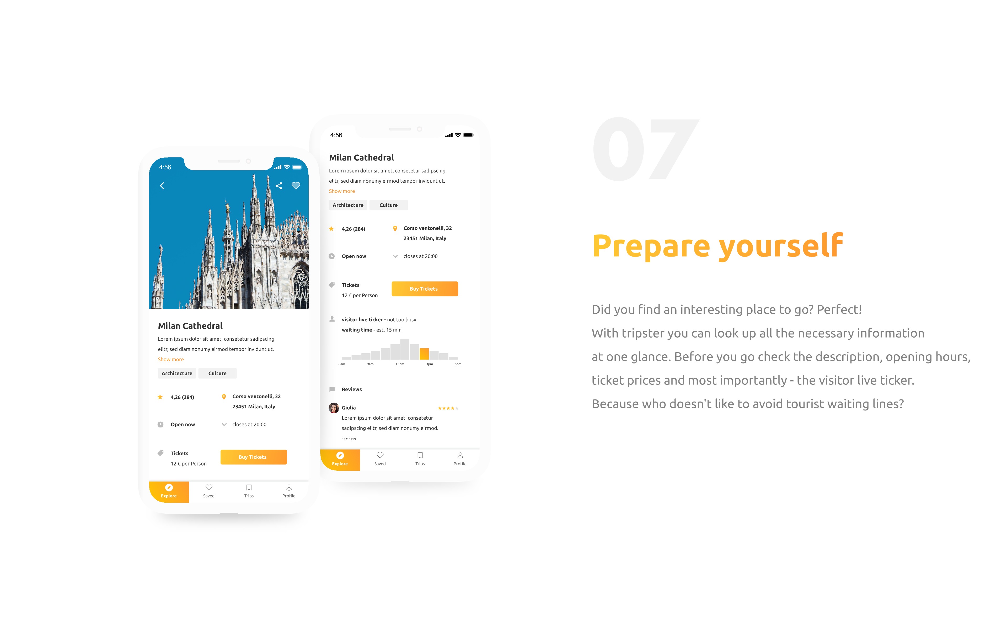
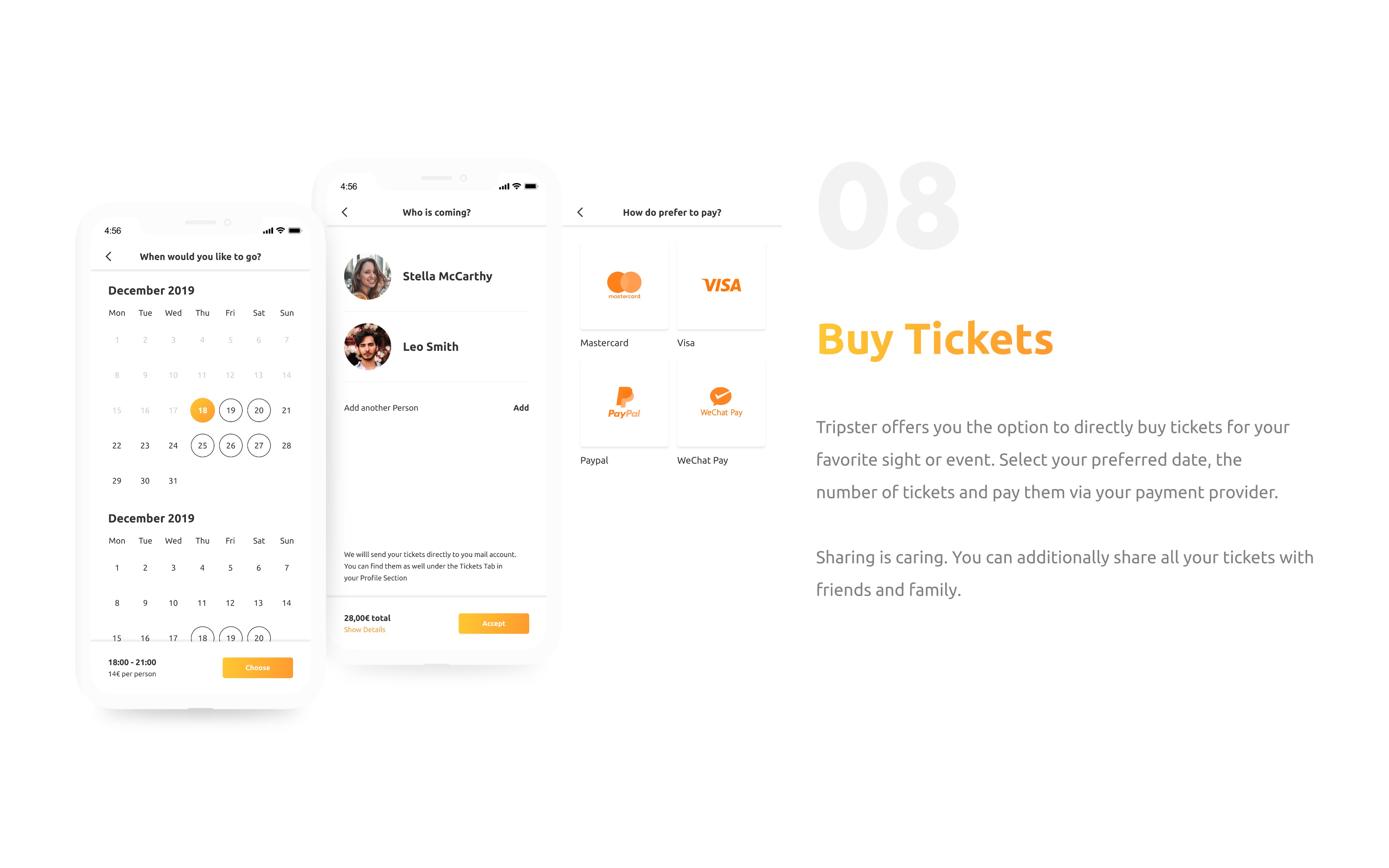
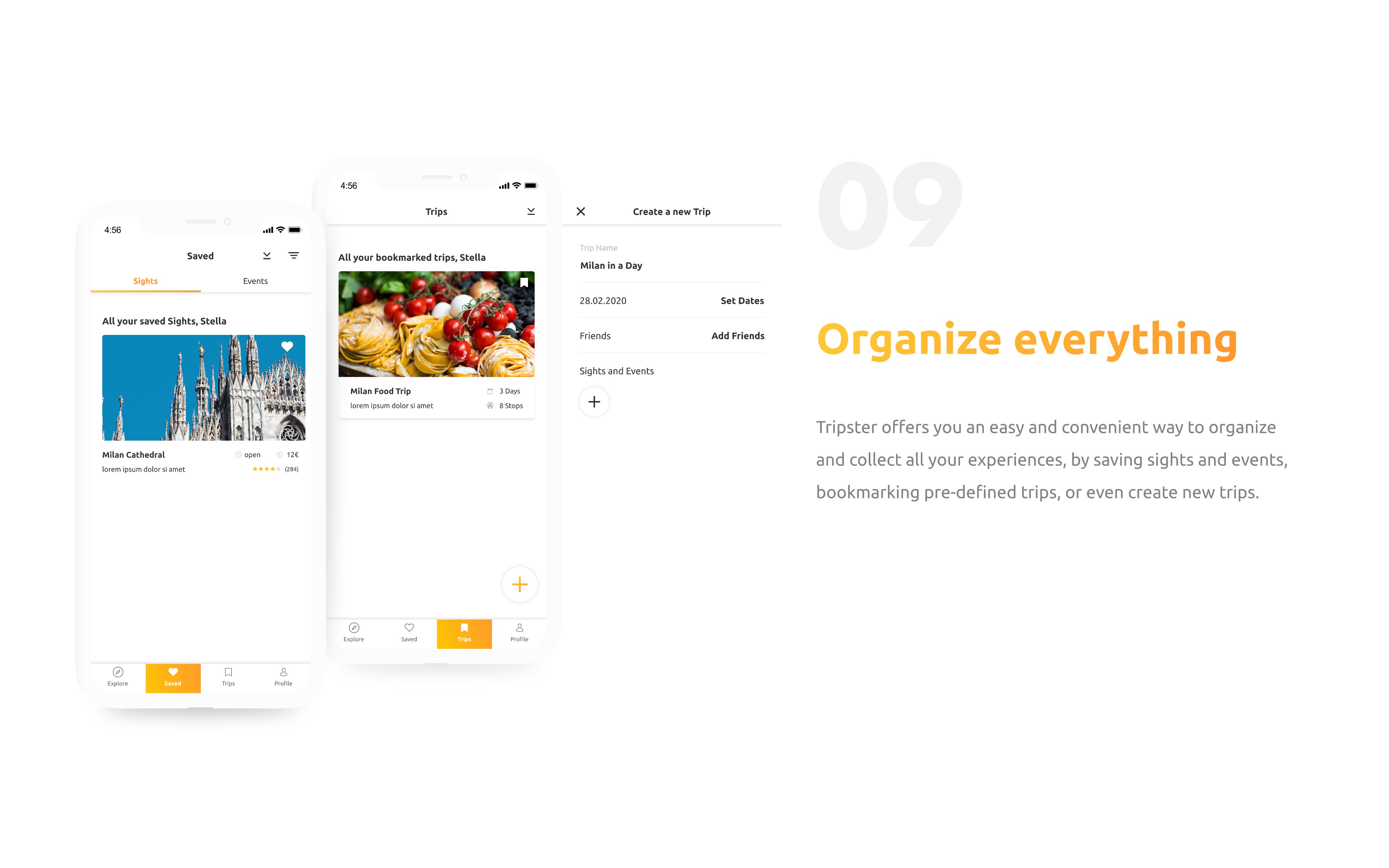
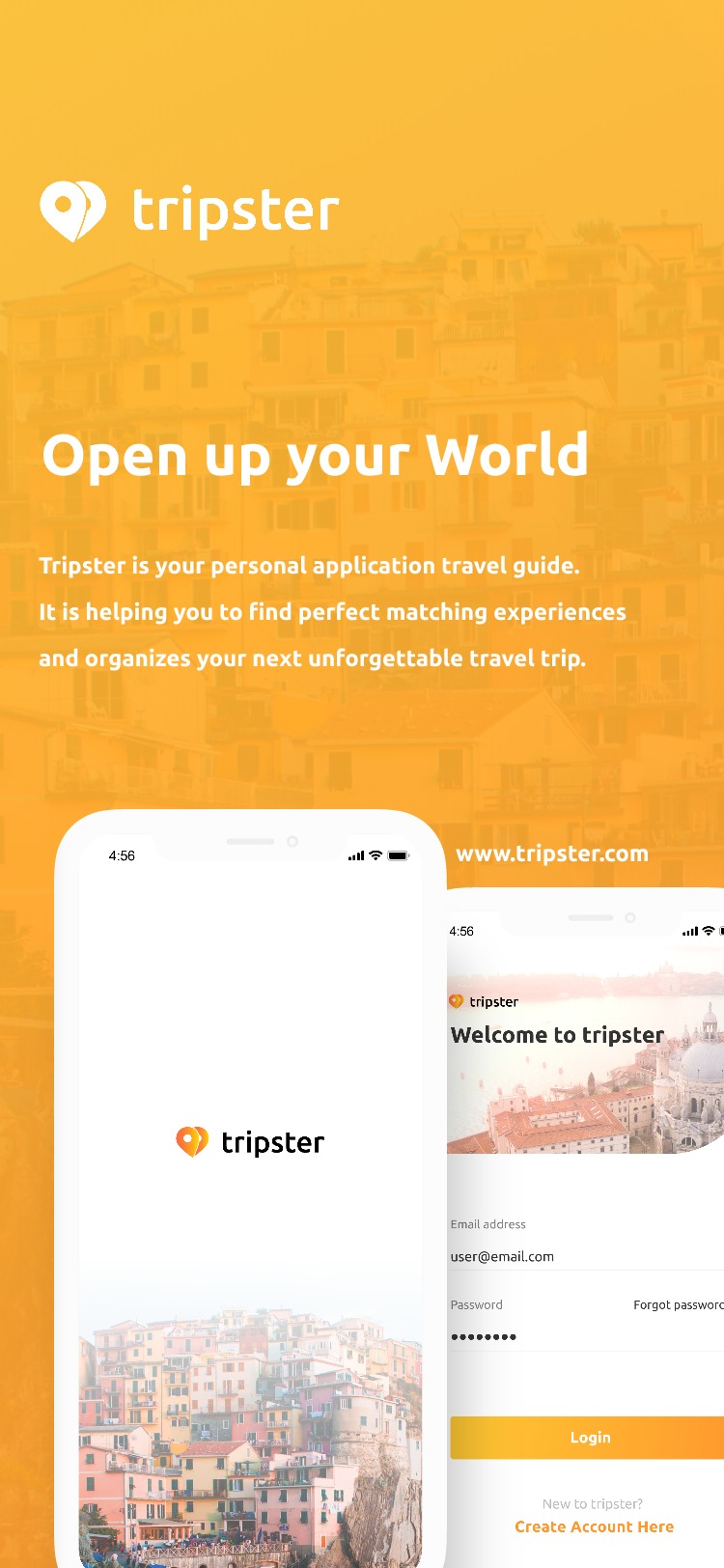
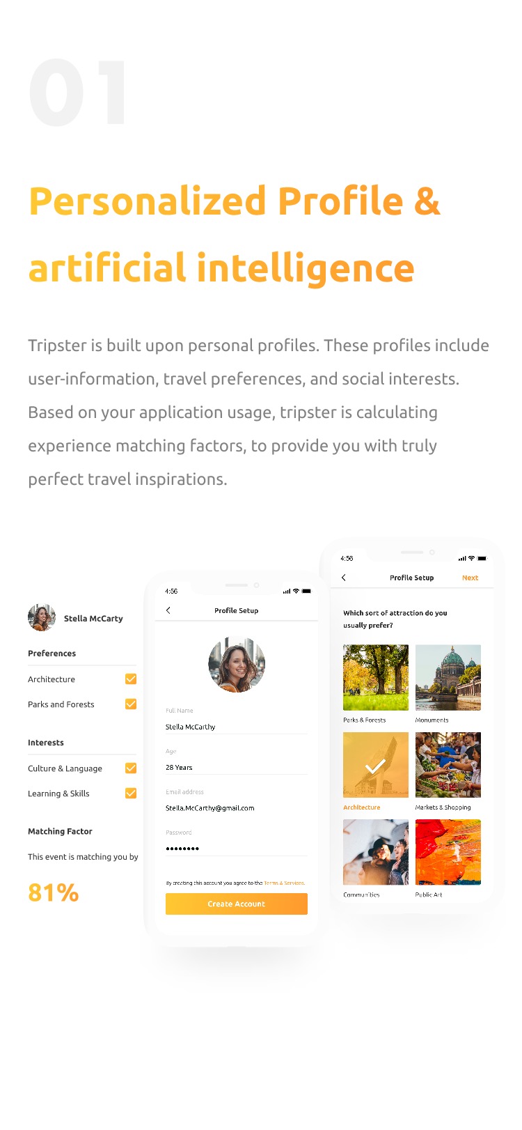
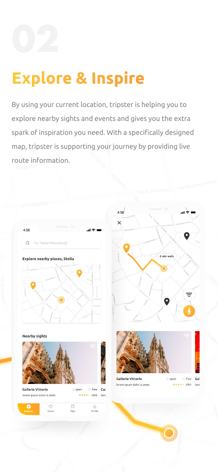
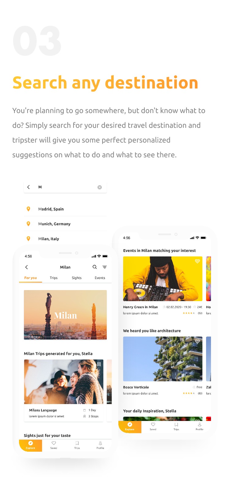
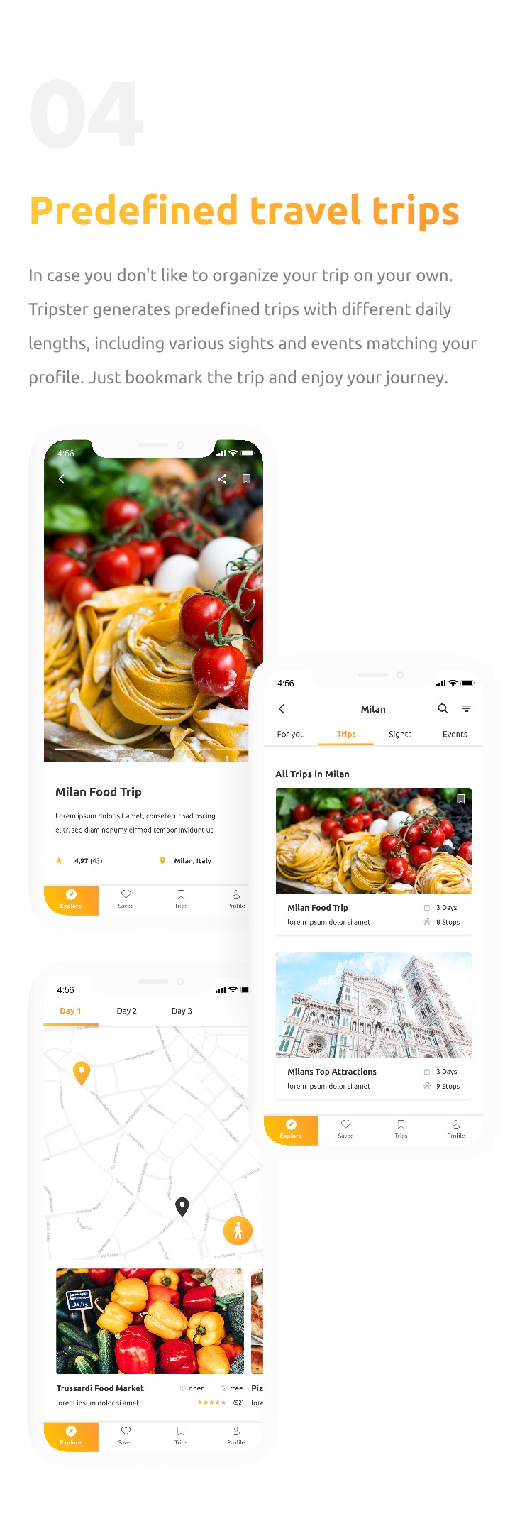
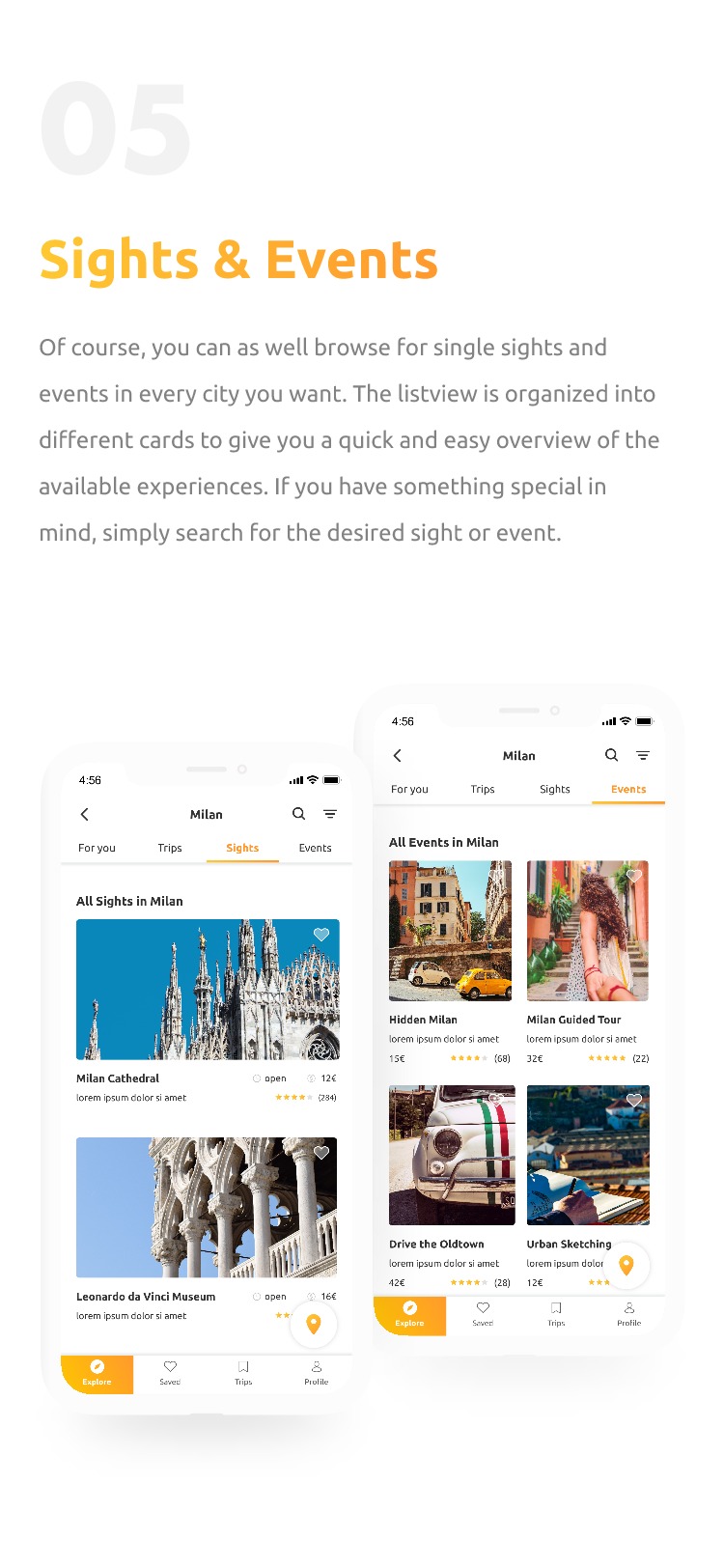
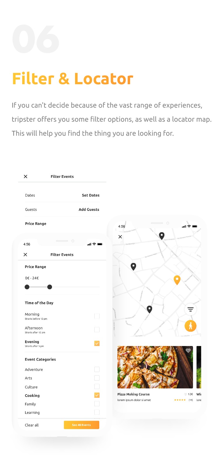
Teamwork
= better work
11 Lessons learned
Of course, working alone has the benefit of shaping everything the way you want to. But I really enjoy working in organized teams. Working on a project together in frequent discourse with your teammates enhances the flourishment of new ideas, brings people together and creates social bonds. This is really something that would have brought me personally and also the tripster concept even further.
Still curious?
Check out some of my other projects
Entertainment experiences for autonomous driving
Audi entertain vision - case study
During my last semester, I got the chance to write my bachelor thesis in cooperation with Audi's HMI team including UX research, UX design, visual design, prototyping and Unity development.
BACHELOR THESIS • 24 WEEKS • JAN 2019 • READING TIME 8 MIN
Building an online presence and visual identity
Gishfang - case study
Gishfang is a music production team that needed an online presence and visual identity. We created it together in cooperation, including UX design, prototyping, visual design, and some art direction.
CLIENT PROJECT • 6 WEEKS • JAN 2019 • READING TIME 6 MIN