Gishfang
Building a visual identity and website
Timeline
6 Weeks
January - March 2019
Project type
Client project
My role
UX Design, and Art Direction
Tools
Adobe Suite,
InVision Studio
Skills
UX Concept, UX Design and Art Direction
Outcome
wireframe concept, visual design
and media content
Gishfang is an urban
music production team
01 Overview
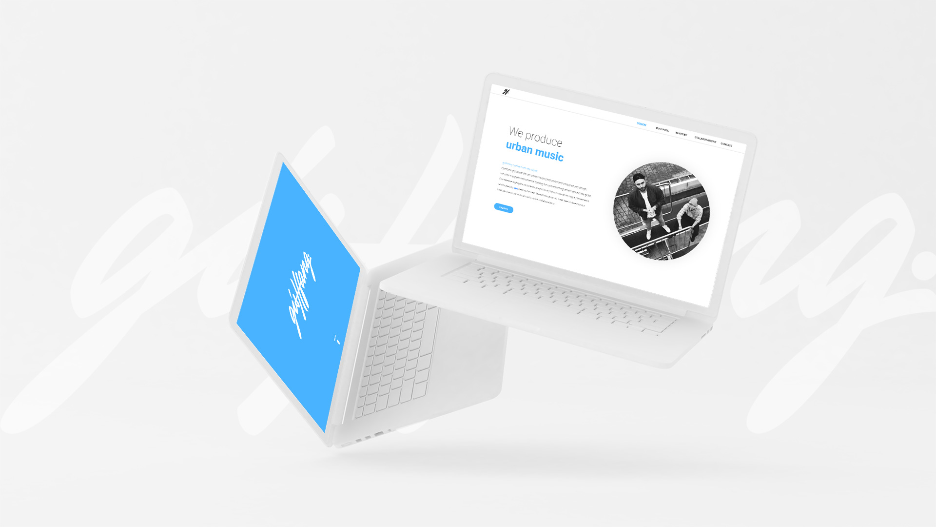
Gishfang needed a brand identity as well as an exciting online presence for their revolutionary sound design. I created their visual identity and following up their webpage. Based on their star sign Pisces, the principal characteristic is the metaphor of water, which was integrated as a guidance for the user to flow through the website.
Interested?
Visit Website
That new brand smell
Building a visual identity
02 Visual identity
We started out laying the foundations of Gishfang's brand by defining their core brand values. These values should be reflected in their visual identity. Subtle colors and a clean typeface to communicate quality and professionalism, combined with an energetic highlight color to keep it unique.
Quality
We deliver qualitative results. Our technical and commercial expertise enables lasting success.
Passion
We refuse to settle. We are continuously innovating, improving and moving forward.
Uniqueness
We don't simply follow. We create unique sound designs paired with well-balanced love for detail.
Starting the journey
Building the user experience
03 User Experience
After a few days of workshops, I focused on the creation of a simple, but comprehensive website user experience for a set of potential visitors ranging from beat buying customers to artists and labels to collaborate with. Through card sorting with the client, we defined the information architecture for the website. After scribbling out ideas and rapidly reviewing them together, the first set of digital wireframes was created.
Website information architecture
Introduction page wireframe
Beat shop and license details page wireframe
Provided services wireframe
Let's put it together
Creating the visual design
04 Design
With the brand identity and wireframes at hand, the visual design of the website came together pretty naturally. The final online presence is a qualitative differentiation from other music production competitors and resulted in an engaging and business goal fulfilling website. Following some selected visuals of the project in no particular order.


Always on the go
Adapting to mobile
05 Mobile
Everything behaves a bit differently on mobile. For touch-based devices, we crafted custom solutions to ensure the same experience you would get on the desktop. More than ever, the content we build needs to be easy to use on the go.
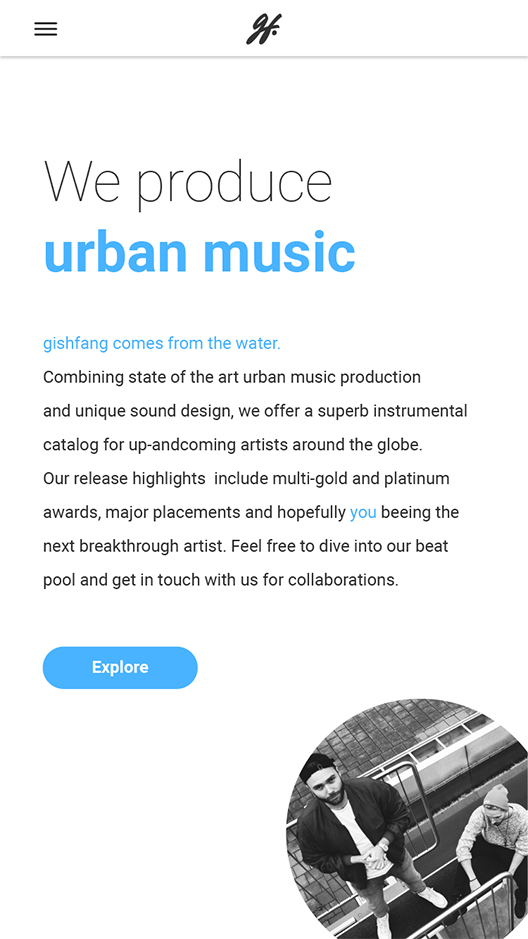
Introduction page
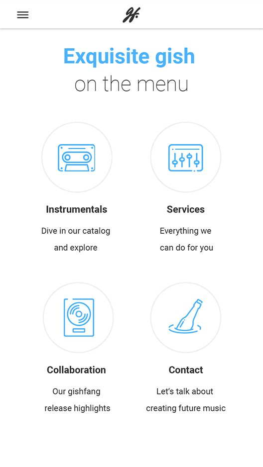
Subpage categories
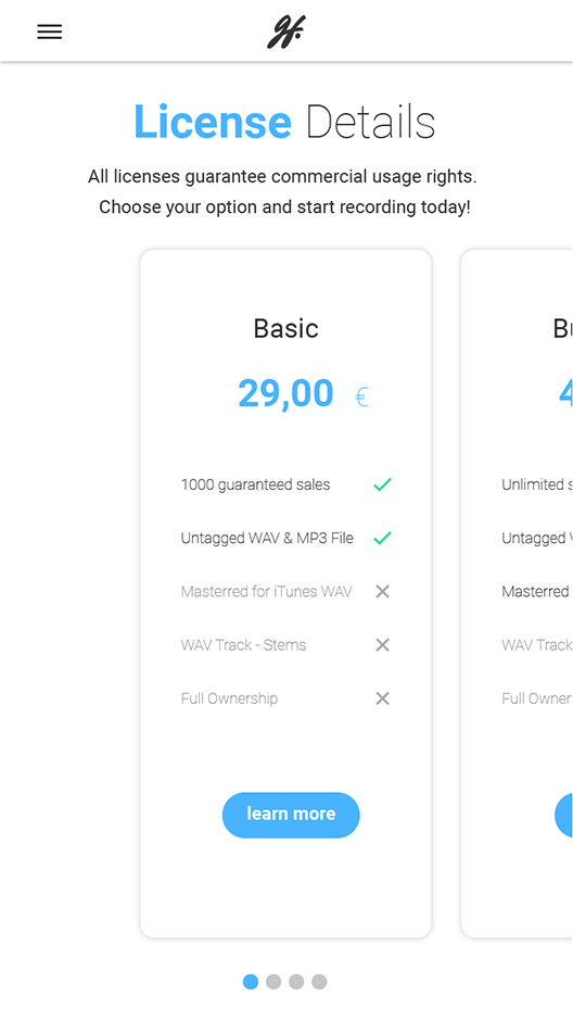
License details
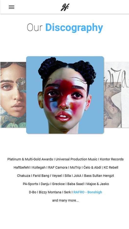
Discography cover flow
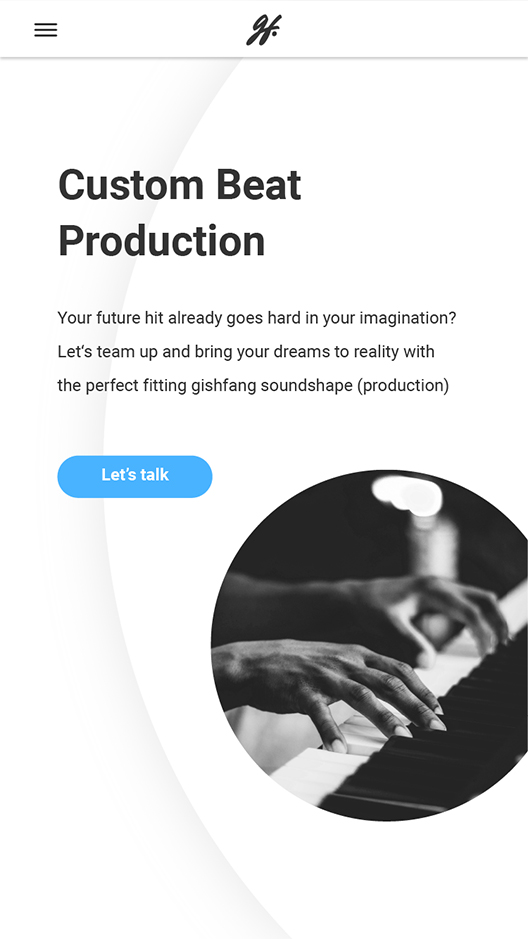
Services page
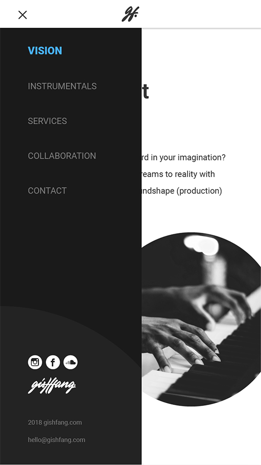
Mobile menu
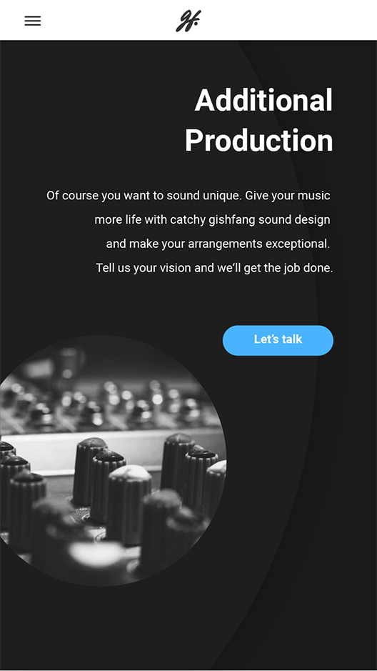
Services page
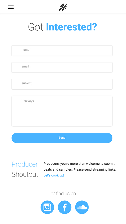
Contact form
The social side of life
Media content creation
06 Art direction
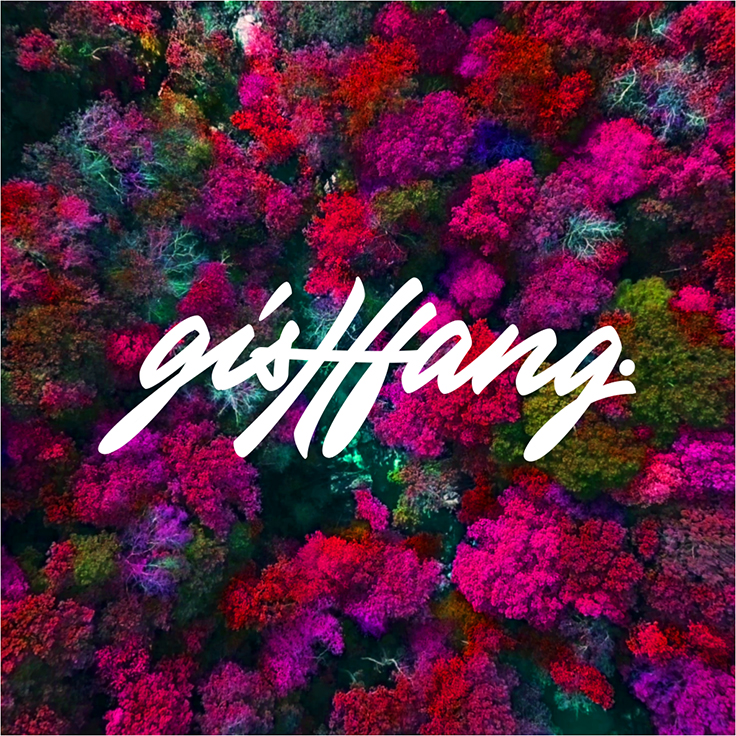
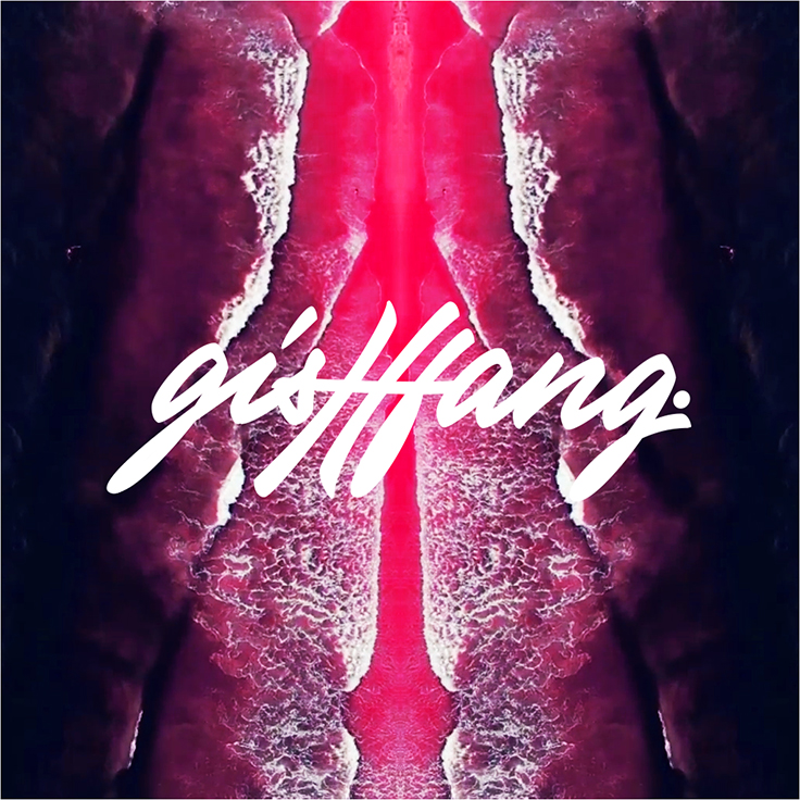
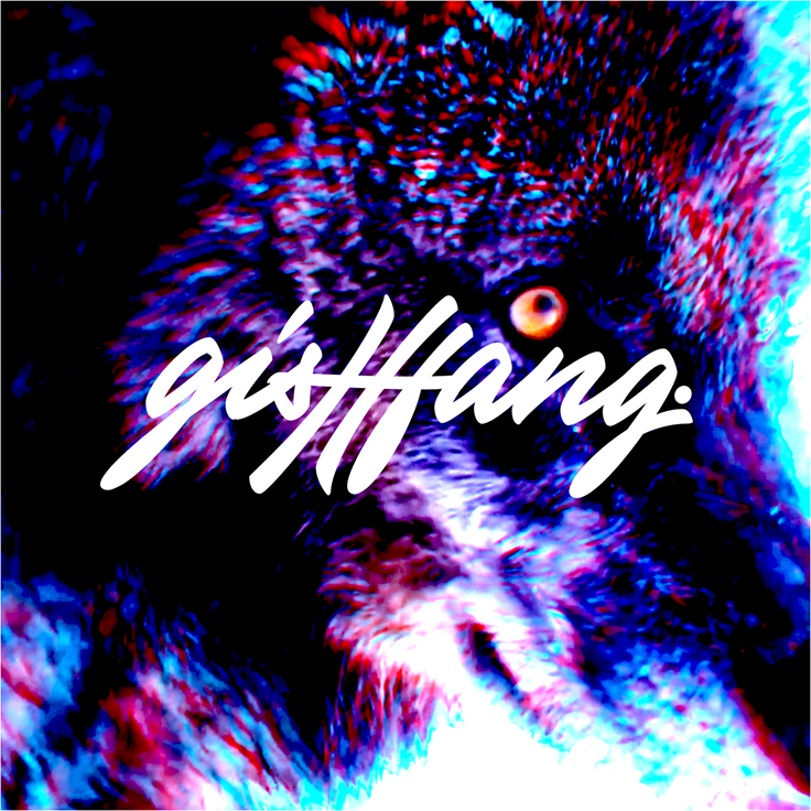
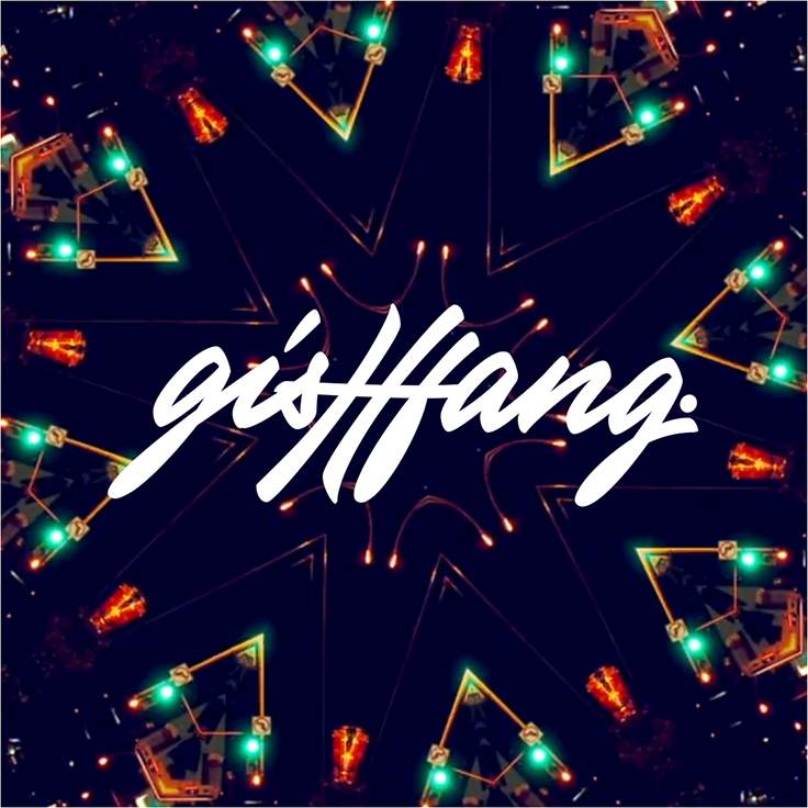
As Gishfang wanted to increase their social exposure, I took care of their art direction for quite some time. During this period I created various album covers, beat videos and social media content. Their goal was to create visual content which is very artistic and even a bit psychedelic, to stand out of the mass and catch the attention of the social media browsing users.
"Working with Joe has been invaluable to the progression of our brand. The design guidance he has provided exceeded our expectations and gives us an impressive visual identity that we are proud to uphold."

Markus Bermann
Co-founder Gishfang
Know your process
Adjust it right
07 Lessons learned
Clients want quick results and sometimes you have to deal with shortly measured timeframes. Knowing and deciding which process works best to achieve the client desired goal saves a lot of work, time and money.
Still curious?
Check out some of my other projects
Entertainment experiences for autonomous driving
Audi entertain vision - case study
During my last semester, I got the chance to write my bachelor thesis in cooperation with Audi's HMI team including UX research, UX design, visual design, prototyping and Unity development.
BACHELOR THESIS • 24 WEEKS • JAN 2019 • READING TIME 8 MIN
Concept for ecological grocery shopping
Eco - case study
In the first semester of my master's studies, we developed together in a team an app concept for the future of ecological grocery shopping. The project was mainly focusing on UX Design, Visual Design and Motion Design.
STUDY PROJECT • 16 WEEKS • MAR 2020 • READING TIME 10 MIN