Eco
Concept for ecological grocery shopping
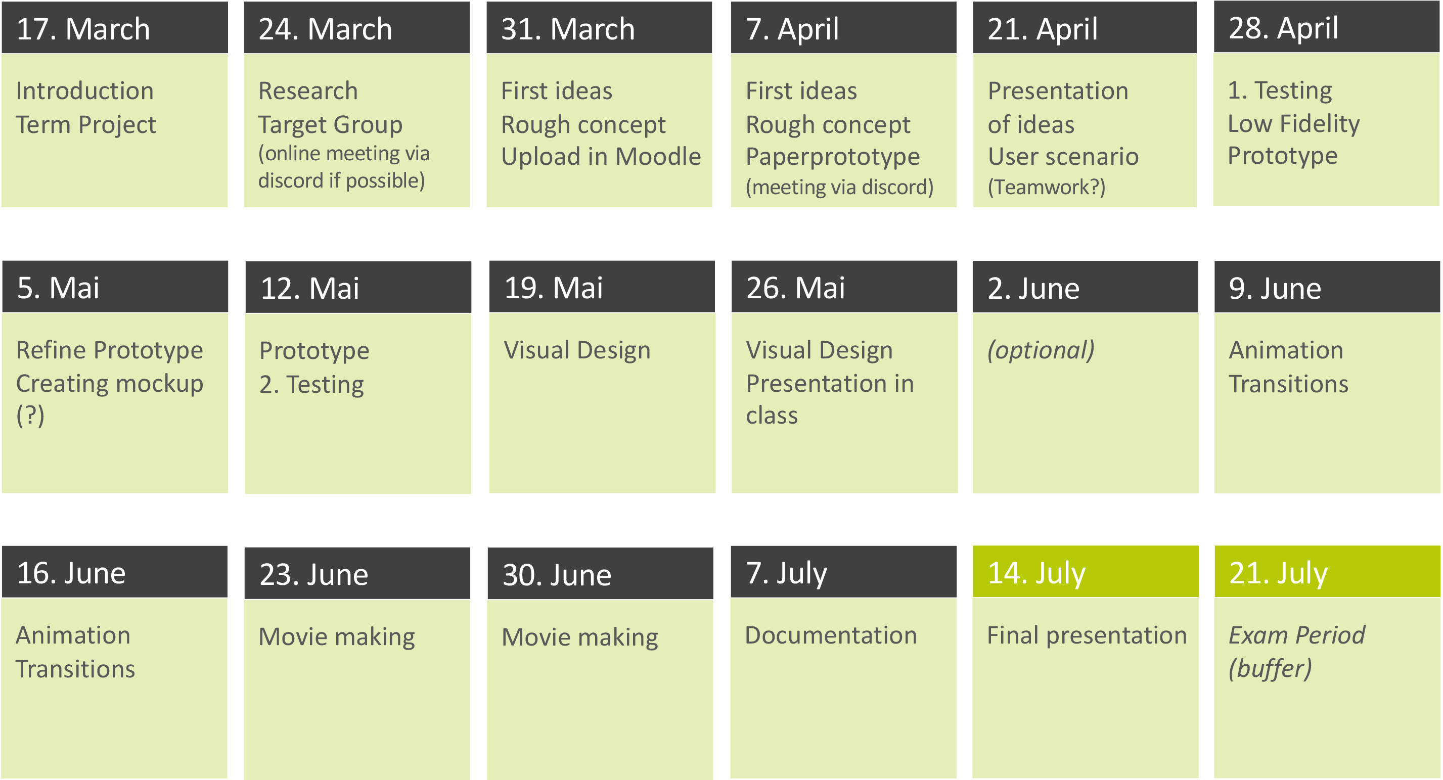
Timeline
16 Weeks
March - July 2020
Project type
Study Project
My role
UX Design, Motion Design
Tools
Figma
Adobe Suite
Skills
UX Research, UX Design, Prototyping, Visual Design, Motion Design
Outcome
wireframe concept, interaction prototypes, visual design and promotional video
Eco is the future of
ecological grocery shopping
01 Overview
In the first semester of my master's studies in the class interface design, we had the initial task of how a specific target group can shop and interact in a supermarket of the future efficiently and with unique user experience. For this task, Julia Malsam and I together developed the app concept eco. Eco creates transparency of the ecological impact of every product in the supermarket, helps and advises people to buy more eco-friendly groceries, and motivates them to make the first step towards a more sustainable future. This project was graded with excellence (1.0)
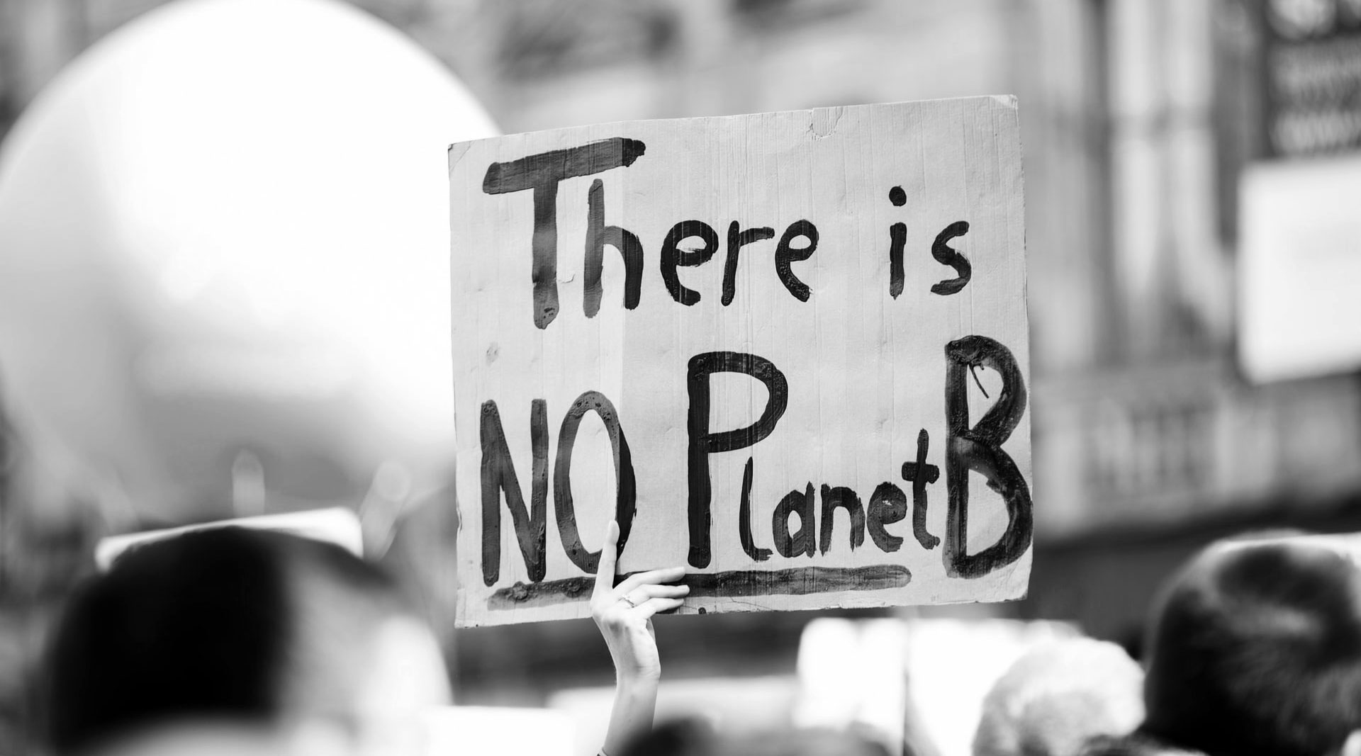
Climate Change is the
biggest problem of our society
02 Problem
According to Science Magazine, the world’s food system is responsible for about 25-30% of the planet-warming greenhouse gases that humans generate each year. We often feel overwhelmed by this global-scale problem and don’t know where to start. Yet if everybody of us could make smarter food choices, we as a collective would have a major impact on solving the problem. But we often don’t know how to shop ecological-friendly and struggle with finding eco-products in the supermarket. Until now there was no real solution for it. We wanted to change that!
Building the Foundation
Research and Knowledge
03 Analyis
Throughout the project, we followed the user-centered design approach. As a first step, we needed to uncover the needs and frustrations of the users in the supermarket and try to figure out what they want. Therefore we carried out an in-depth research and analysis phase. Out of the research, our idea for ecological grocery shopping emerged.
Project plan
Context Analysis - Motivation
Why are you going there?
For the context analysis, we started off with some literature and online research. Additionally, we conducted four semi-structured user interviews, to get real user insights. The first major aspect we asked was: “Why do people shop in a specific supermarket? What is the user’s motivation to go there?” We were able to identify six key values that motivate people to go to a specific supermarket.
Context Analysis - Action
Why are you going there?
The next aspect we asked was: “What actions do the users perform when they go grocery shopping?”. Therefore, we carried out field observations at home and in the supermarket to be able to see the user's natural grocery shopping behavior. We were able to cluster our insights into three action categories.
Target Groups
Different types of customers
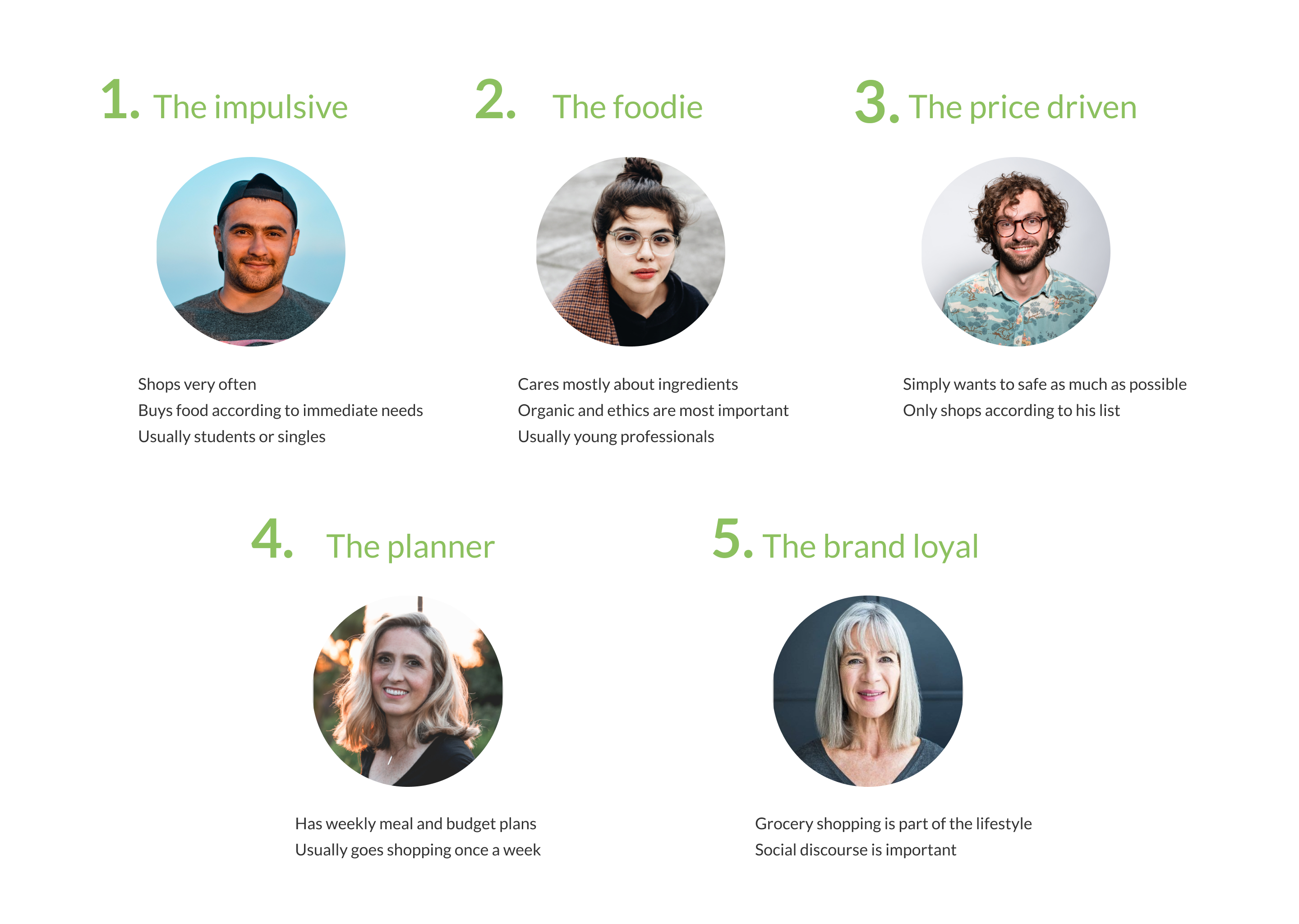
After the context analysis, we shifted the focus and tried to understand: "Who are the different types of customers?" From the research, we were able to cluster our possible target group into five different archetypes.
Global Trends
Expanding our Horizon
To expand our horizon even further, we took current global trends into account. Trends we found especially interesting were neo ecology, digitalization, knowledge culture, as well as their respective sub-trends. This was a crucial step in our process because our focused trends acted as reference points, we could always go back to and check if we are moving in the right direction.
The sparkling ideas
Brainstorming for the win
04 Ideation
We started our ideation process by generating different ideas and directions. We decided to pick the project idea of ecological friendly grocery shopping. Trying to have an ecologically sustainable lifestyle is a current and very relevant topic as most of us know. The key focus was to answer the question: “How can we create a concept that makes it as easy as possible to shop ecologically friendly?”
User goals
eco-friendly shopping
To take a closer look at the obstacles that occur when people try to shop eco-friendly, we again conducted two interviews, with friends that matched our customer archetype type of the functional foodie. We discovered some main problems and formulated them as user goals to focus on within our concept. Following just some examples in no particular order.
It's all about the user
Personas
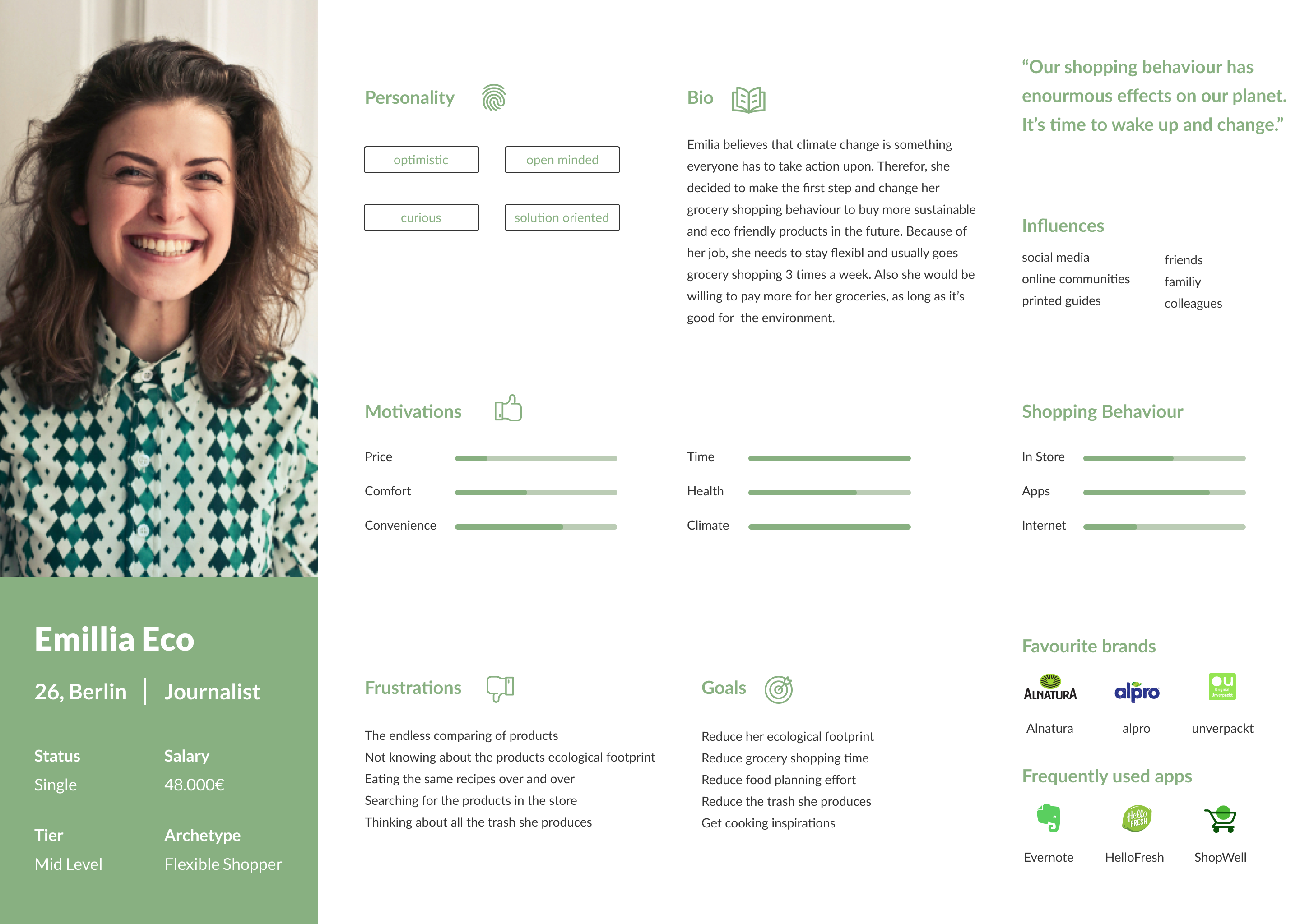
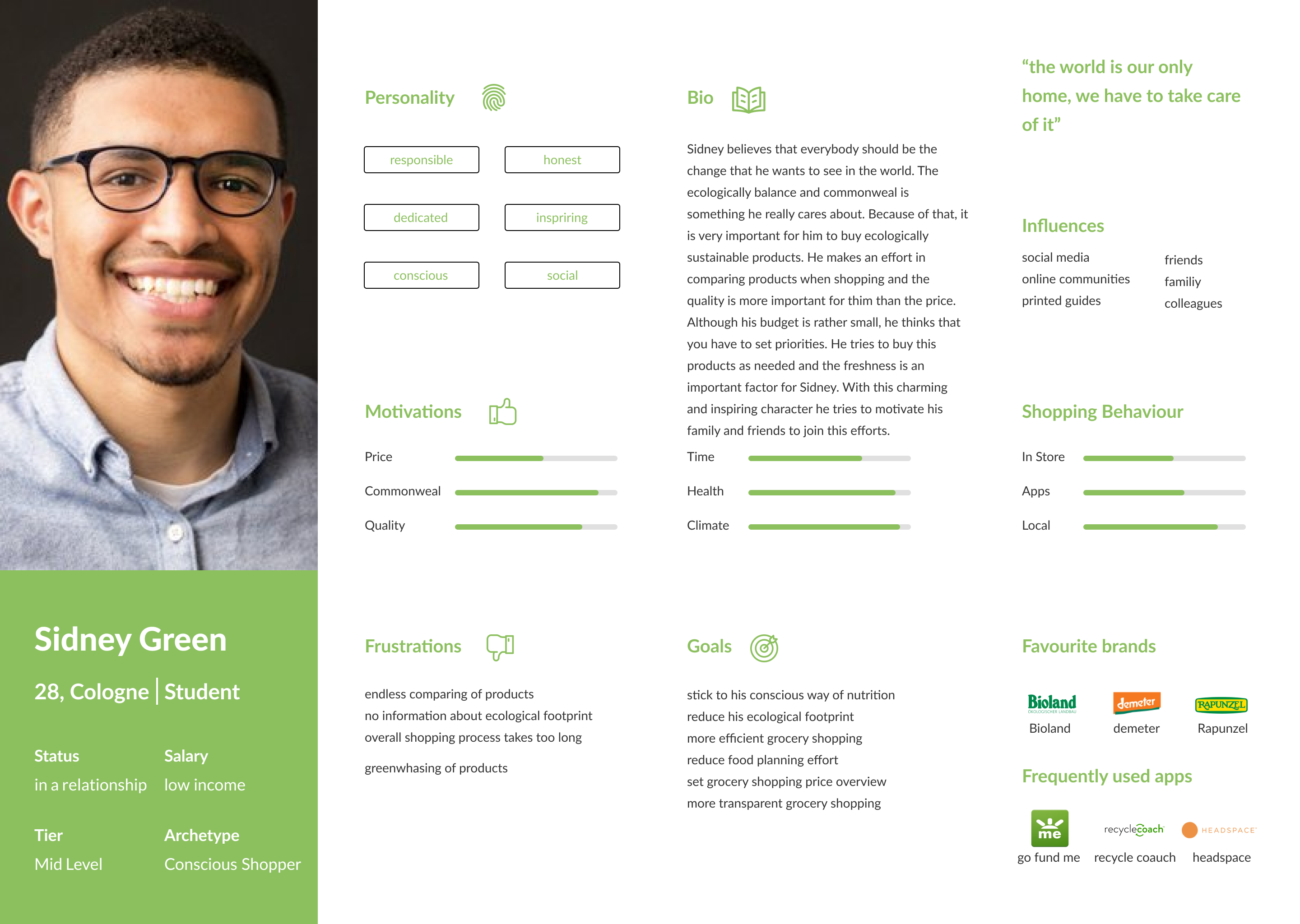
With the help of our two personas, we provided a “face” to our user group, creating more empathy and understanding about the person using the product. It helped us to step out of ourselves and prevented us from applying our mental models to the design which may not align with the actual user needs.
Storytelling
User Stories
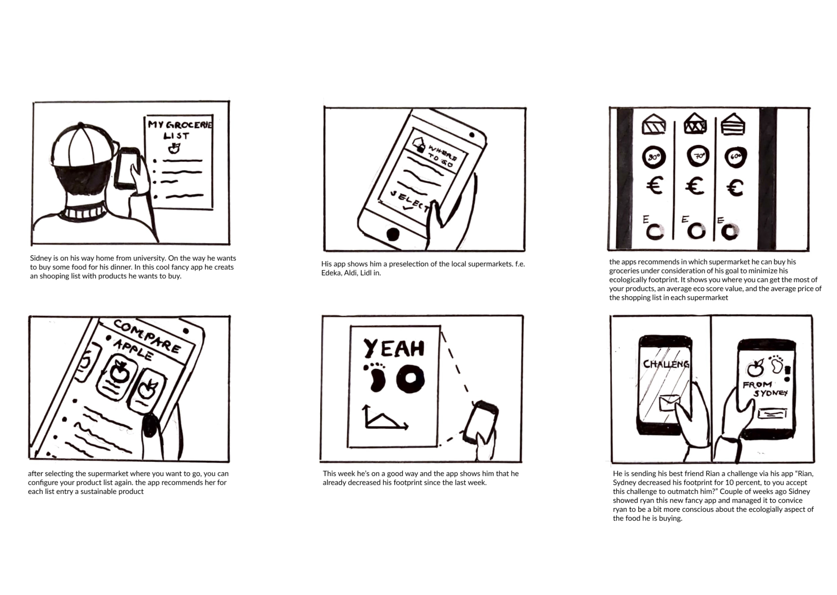
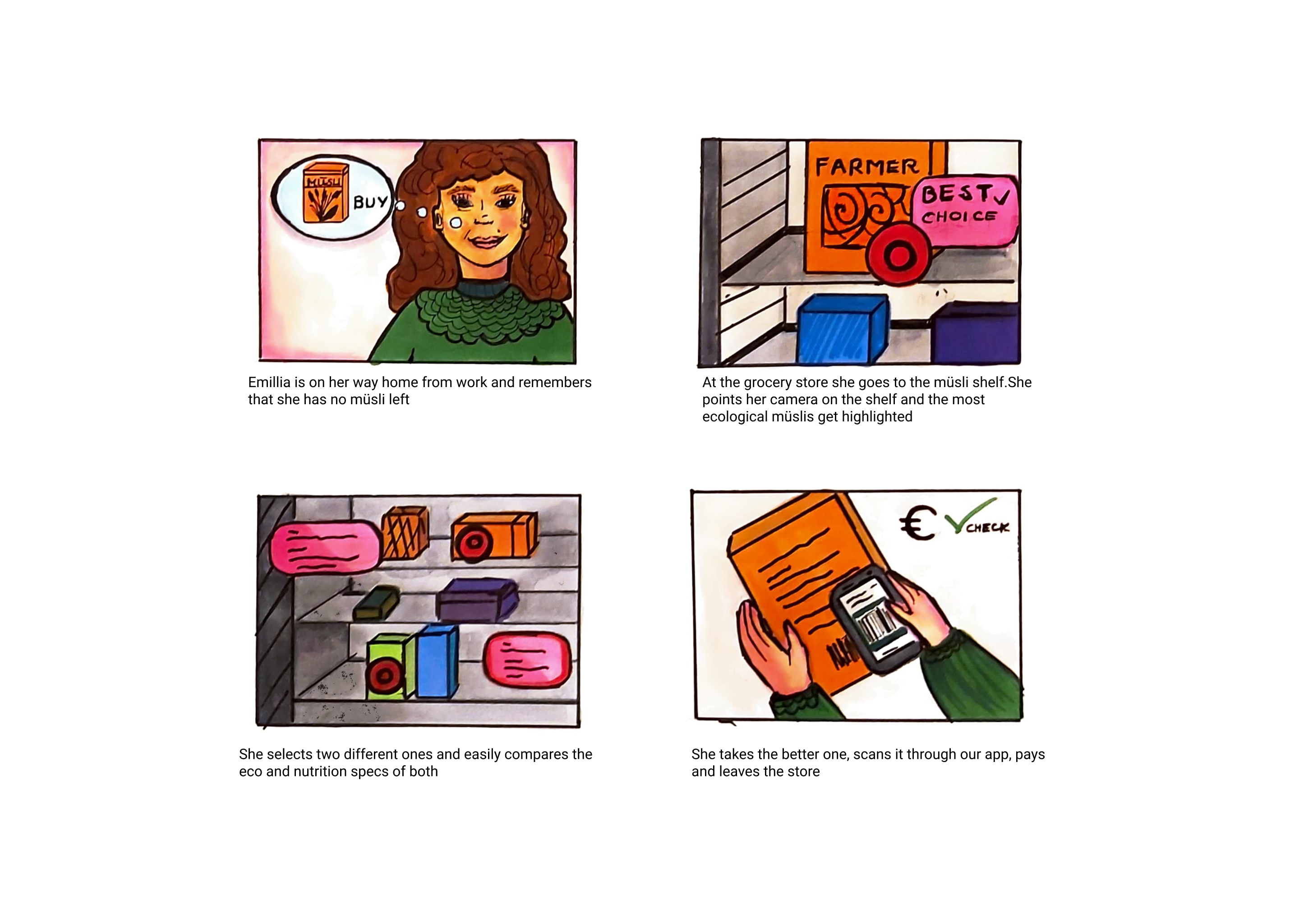
Based on our research understanding and with the help of our personas, we created some fictional stories of possible situations during the ecological grocery shopping process. This helped us to generate ideas on how we can provide a suitable solution. As a first step, we created some smaller mini-stories, which were later combined to create two main storyboards.
Functions and Features
Affinity Mapping
With our defined eco concept idea at hand, we decided to choose the creative technique of affinity mapping as an approach to come up with solutions for functions and features, our first rough information architecture as well as our eco concept strategy.
Unstructured Brainstorming
Structured Affinity Map according to relationships and similarities
Look beyond the in-store experience
Eco strategy – Part One
05 Strategy
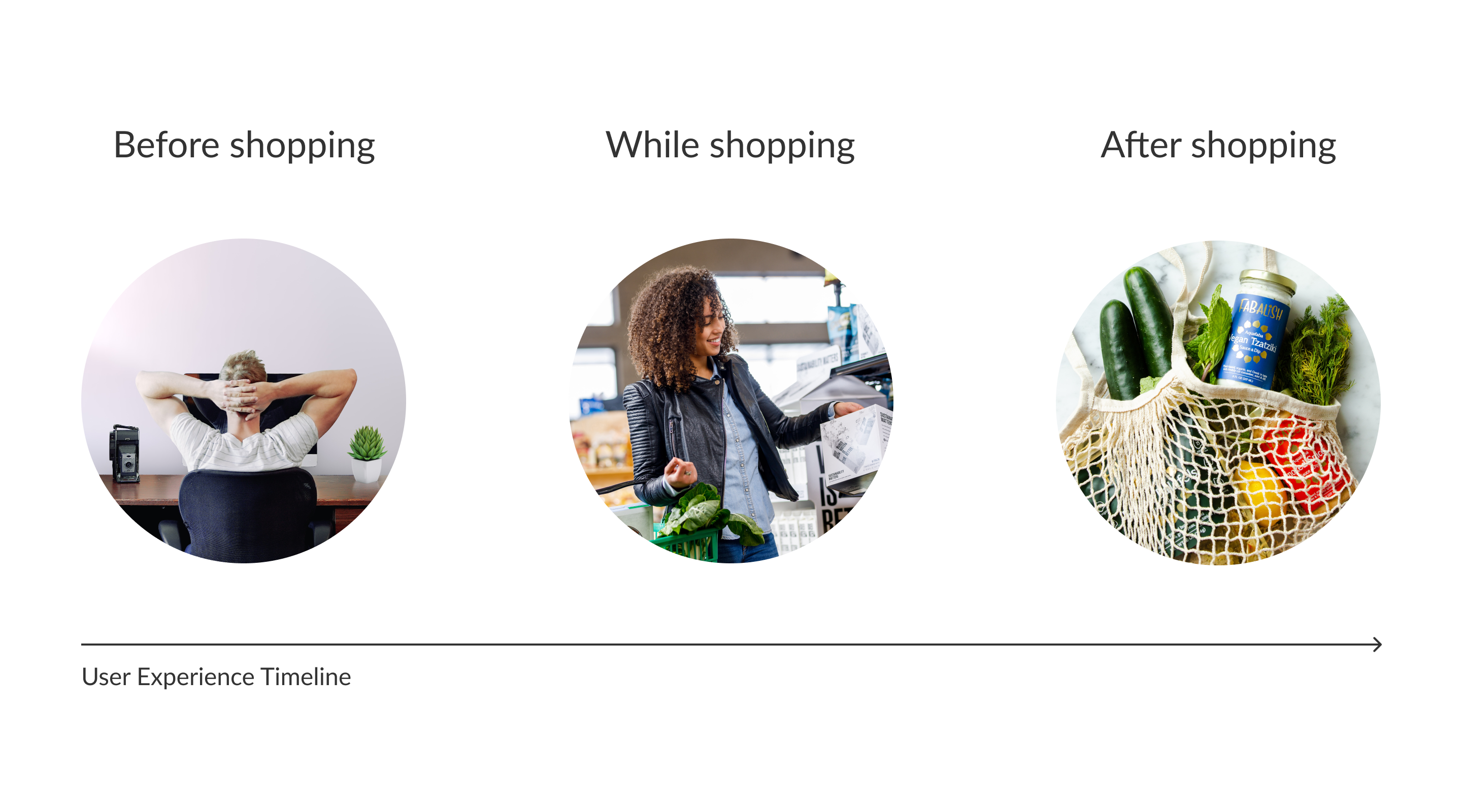
Our concept strategy consisted out of two different parts. The first part was to create a holistic ecological grocery shopping experience by looking beyond the mere in-store experience and taking the before-shopping and after shopping experience as well into account. The initial idea was already gathered in the research, but it was very interesting to see, how our ideas in the affinity map emerged out of it.
Personal as well as social
Eco strategy – Part Two
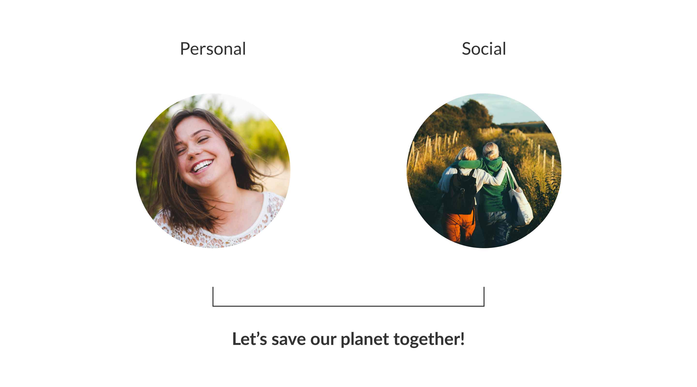
The second part of the strategy was, that ecological grocery shopping should be personal as well as social. For us, ecological shopping has a huge social potential. We want to motivate people to take the first step for an ecological future and want to trigger ecological communities. We want to emotionally engage our users and give them the feeling of really saving the planet together.
Where is Pen and Paper?
Sketches and Flows
06 Concept
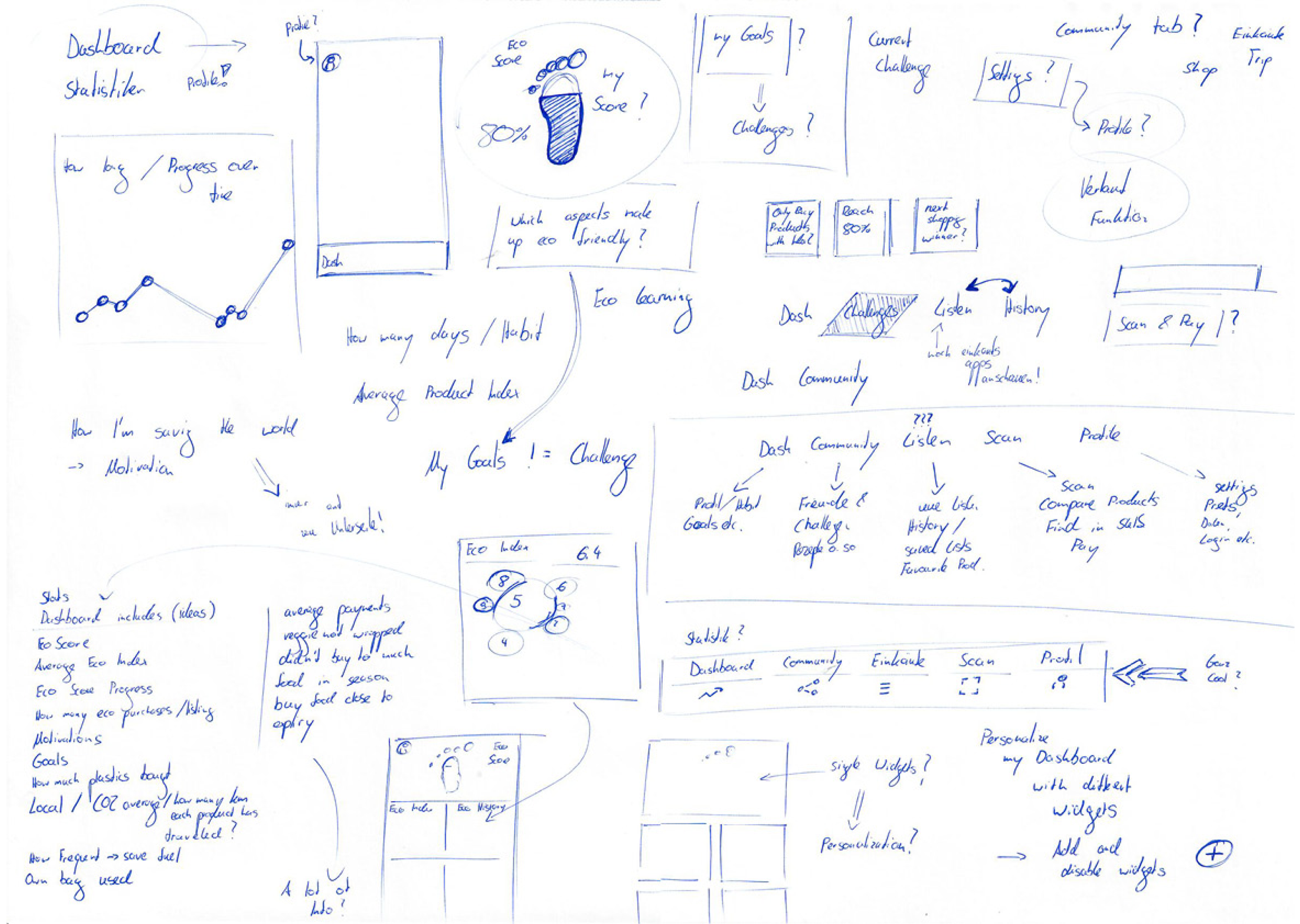
The best way to bring the first ideas into life is just to sketch them down. It was a broad exploration in order to be as creative and free as possible in the very beginning. Following up, we structured our ideas as wireframe flows and started to think about specific functions and their position in the app.
Rough Sketches
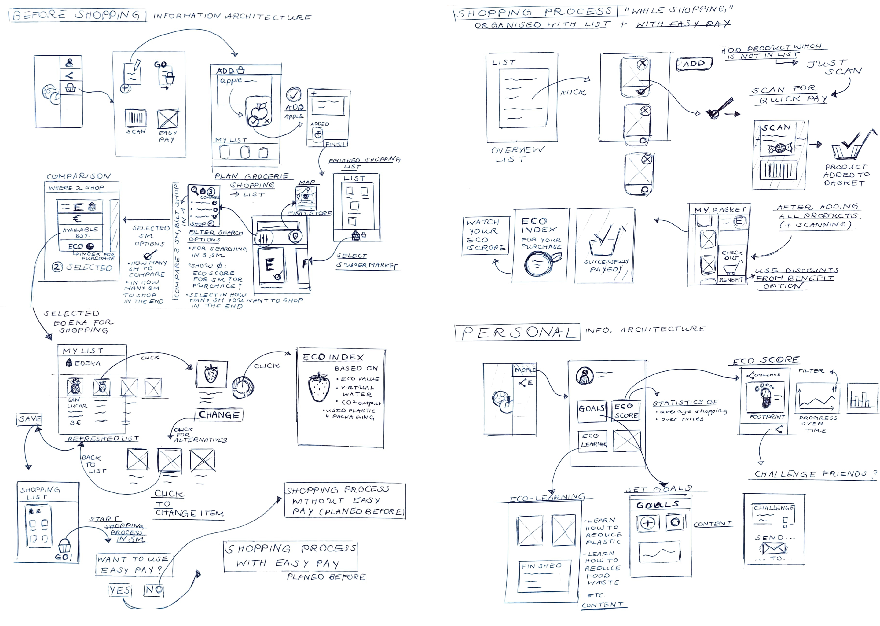
Sketched Flows
Digitializing
Wireframes and Clickdummy
With the help of our sketches, we digitalized our ideas as wireframes in Figma. We intentionally skipped the step of building a paper prototype, because of the 2020 lockdown situation we unfortunately could not meet in person. With the wireframes at hand, we created a first clickable low fidelity prototype which we could both evaluate remotely.
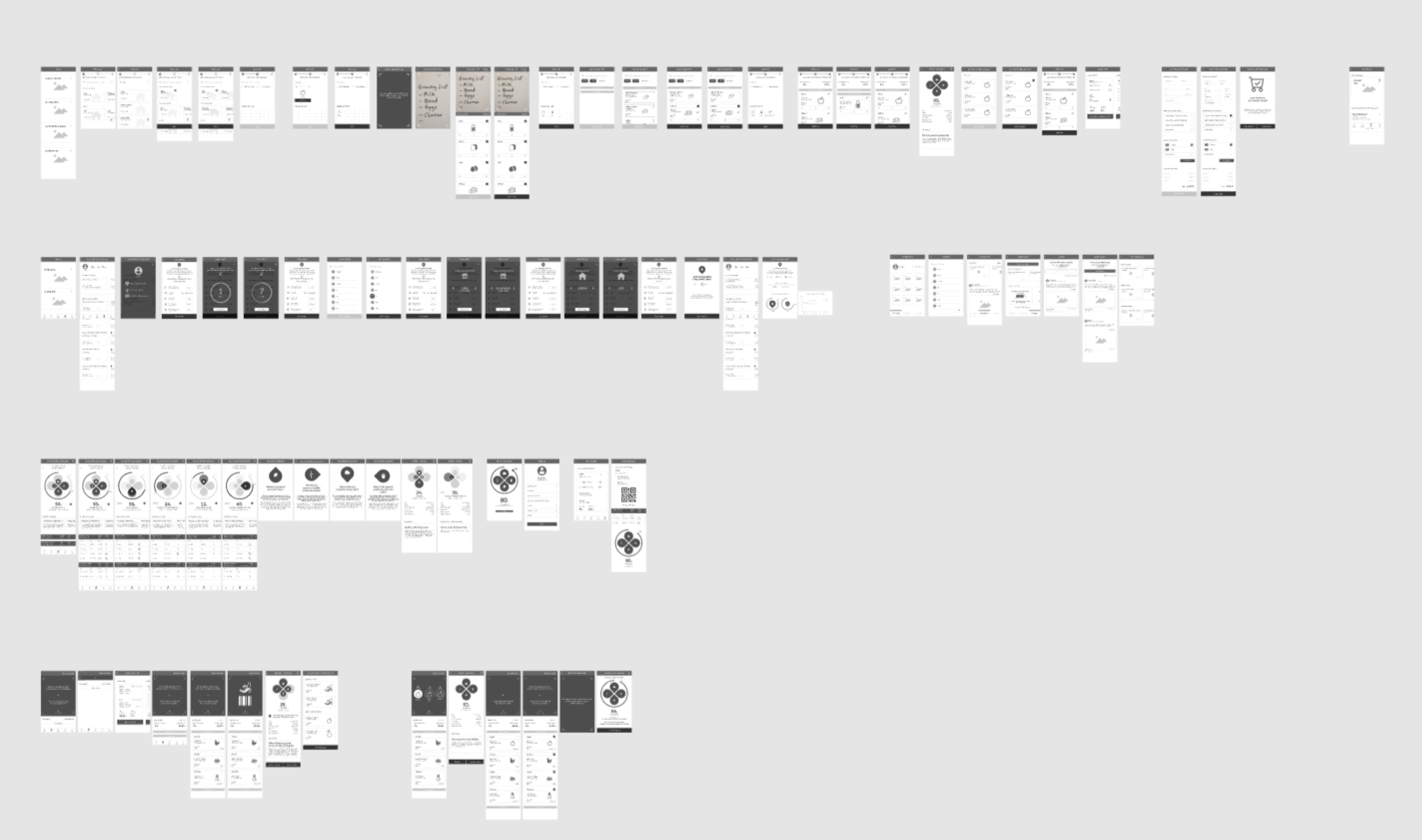
Wireframes in Figma
Asking the user
Evaluation Loop One and Two
07 Evaluation
It was not part of the initial project scope planned by the professor, but we decided to conduct two evaluation loops to refine our concept according to real user feedback. We tested the prototype in two usability tests with eight participants. Throughout the test, we asked the participants to utilize the thinking aloud method and took voice and video recordings of them. Following is demonstrated how, for example, the Eco Score section was enhanced according to the user feedback.
Before Evaluations
Initial Eco Score to track eco shopping progress
After Evaluation One
Enhanced Button layout and added option to view purchased products
After Evaluation Two
Enhanced menu structure, switching timeline with purchased products and added Eco shopping tips
The Final Concept
Information architecture
08 Concept Result
To have a comprehensive overview and communication basis throughout the project, we continuously developed the information architecture of our concept. In the end, our eco concept was structured into 5 different categories, which will be briefly explained in the following.
Plan category
The “Plan” category includes everything the user wants to do before going shopping. Especially interesting is the creation of store-specific grocery shopping lists, which will lead the user to ecological product recommendations.
Creating a new list
Adding food to the list
Receiving an eco recommendation
Go category
The “Go” category, includes everything the user wants to do during the eco shopping experience. Foremost we were focusing on how to receive ecological characteristics of products, how to compare them, and how to receive eco alternatives within the supermarket.
Default Scanning Screen
Scanning products
Receiving eco characteristics
History category
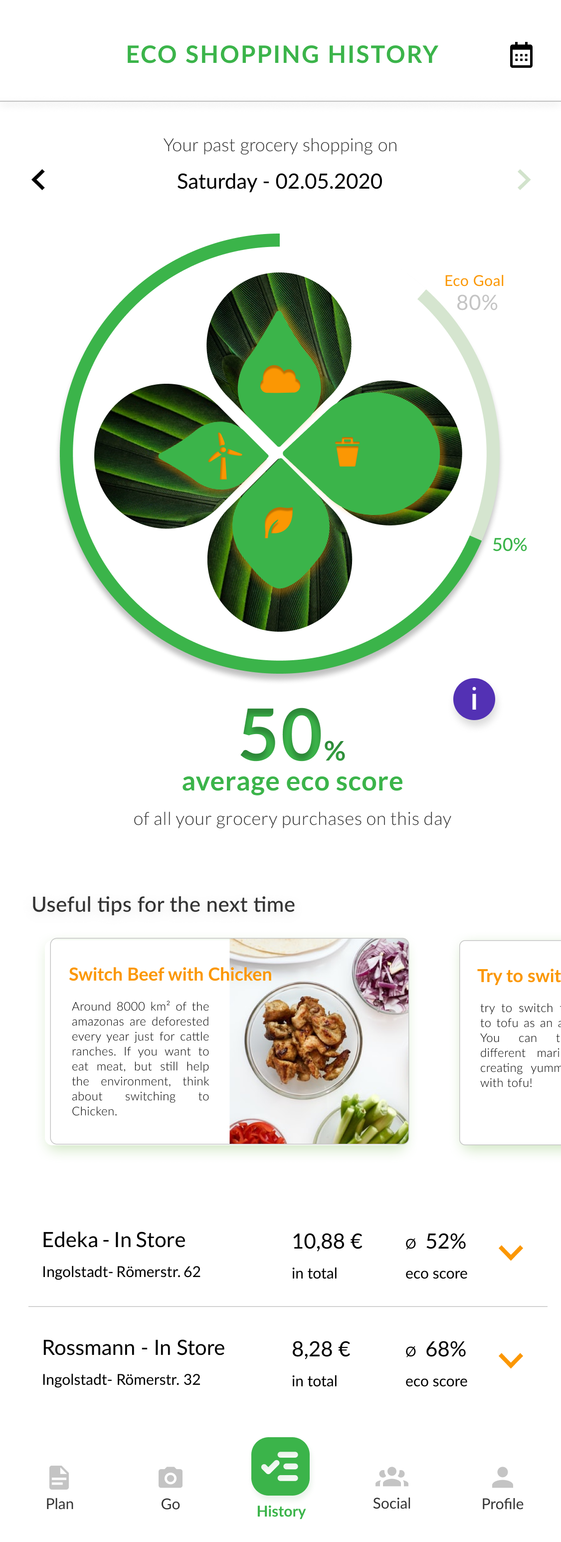
The “History” category includes mostly what the user will experience after going to eco grocery shopping. For this, we developed a system on how the user can track his or her ecological shopping progress with an eco-score, receive useful tips, and oversees the recent purchases and inventory.
Eco History with Eco Score
Eco Score Detailed Info
Product Eco Characteristics
Social category
The “Social” category includes everything related to shopping ecologically together. Foremost we were working on creating eco challenges with friends as well as a community section to share eco grocery shopping experiences with others.
Challenges Overview
Challenge Details
Community Section
Personal category
Finally, In the “Profile” section the user mostly has the possibility to set general personal-related options, like for example setting their eco goal or payment preferences. Additionally, they have the option to view their delivery track and pick-up eco shopping orders in here.
Profile Overview
Set my Eco Goal
Manage Pick-ups and Deliveries
Design Exploration
From Frames to Design
09 Design Exploration
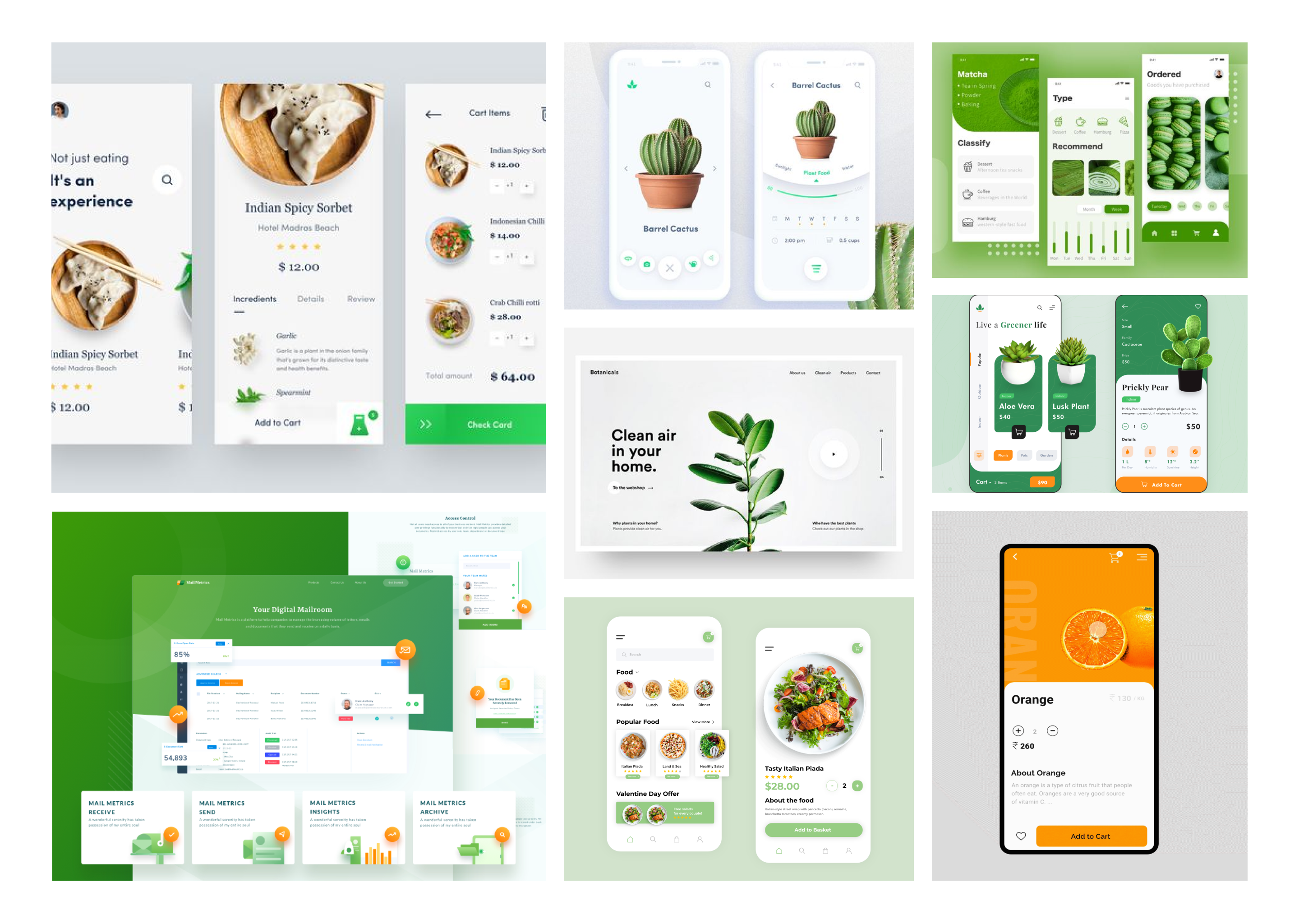
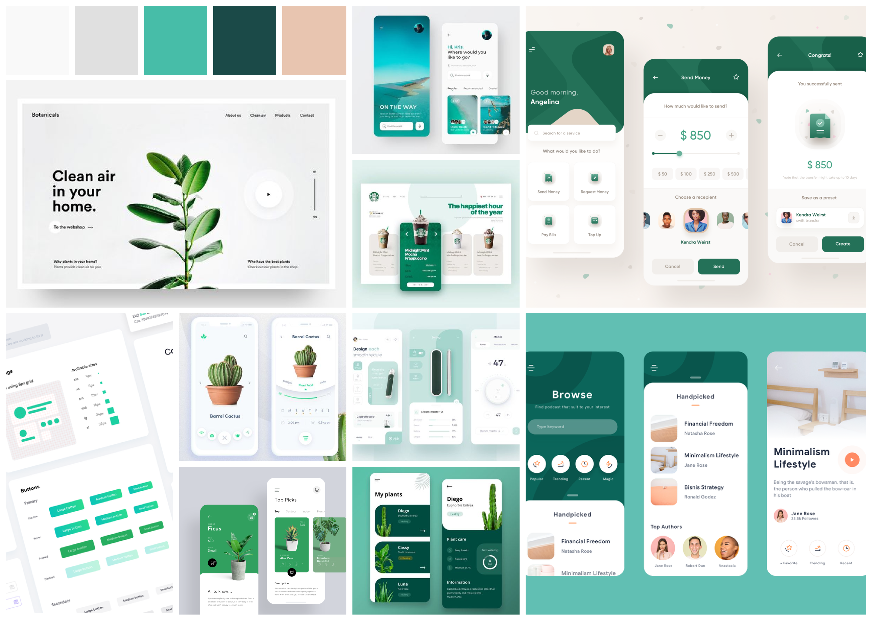
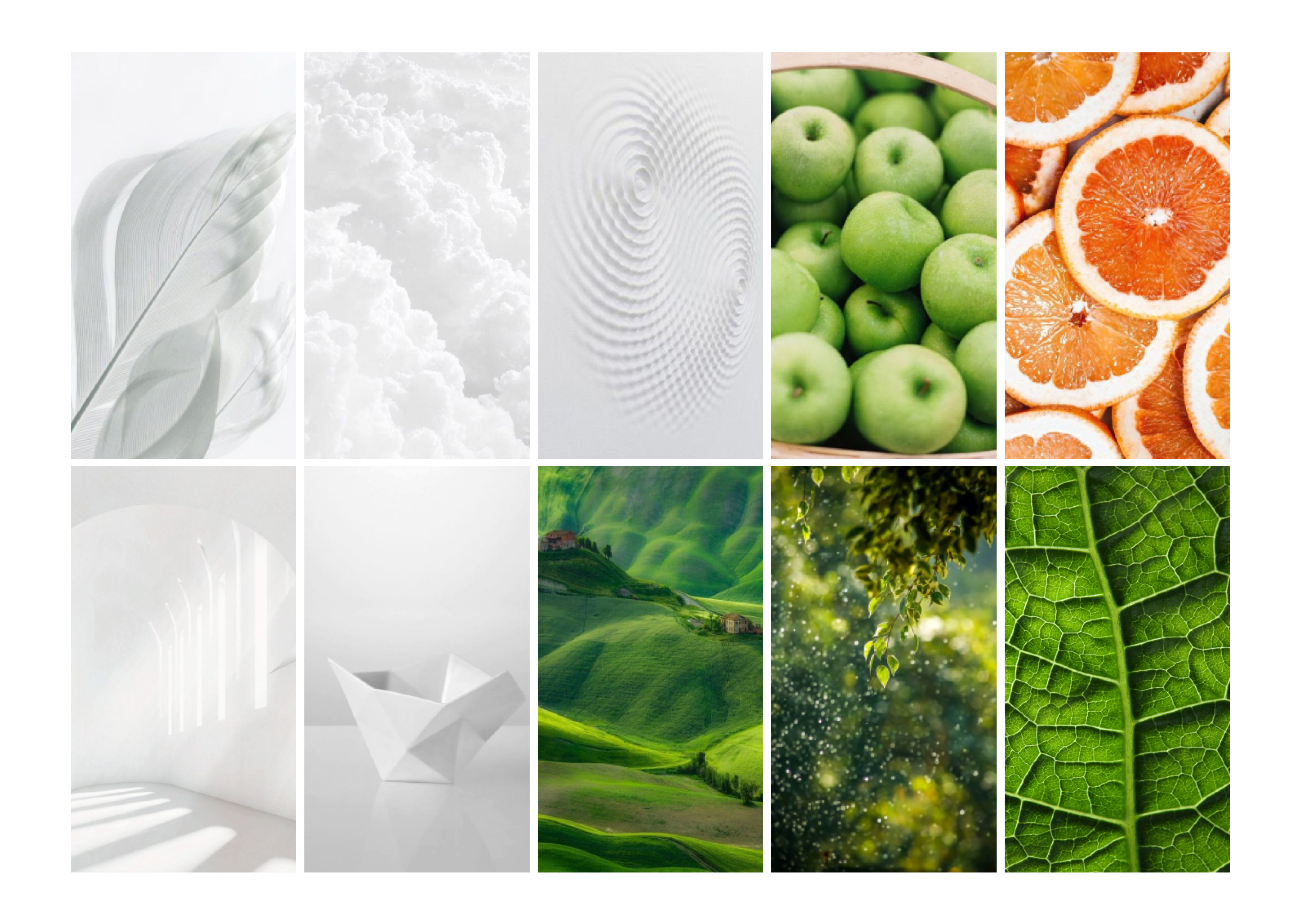
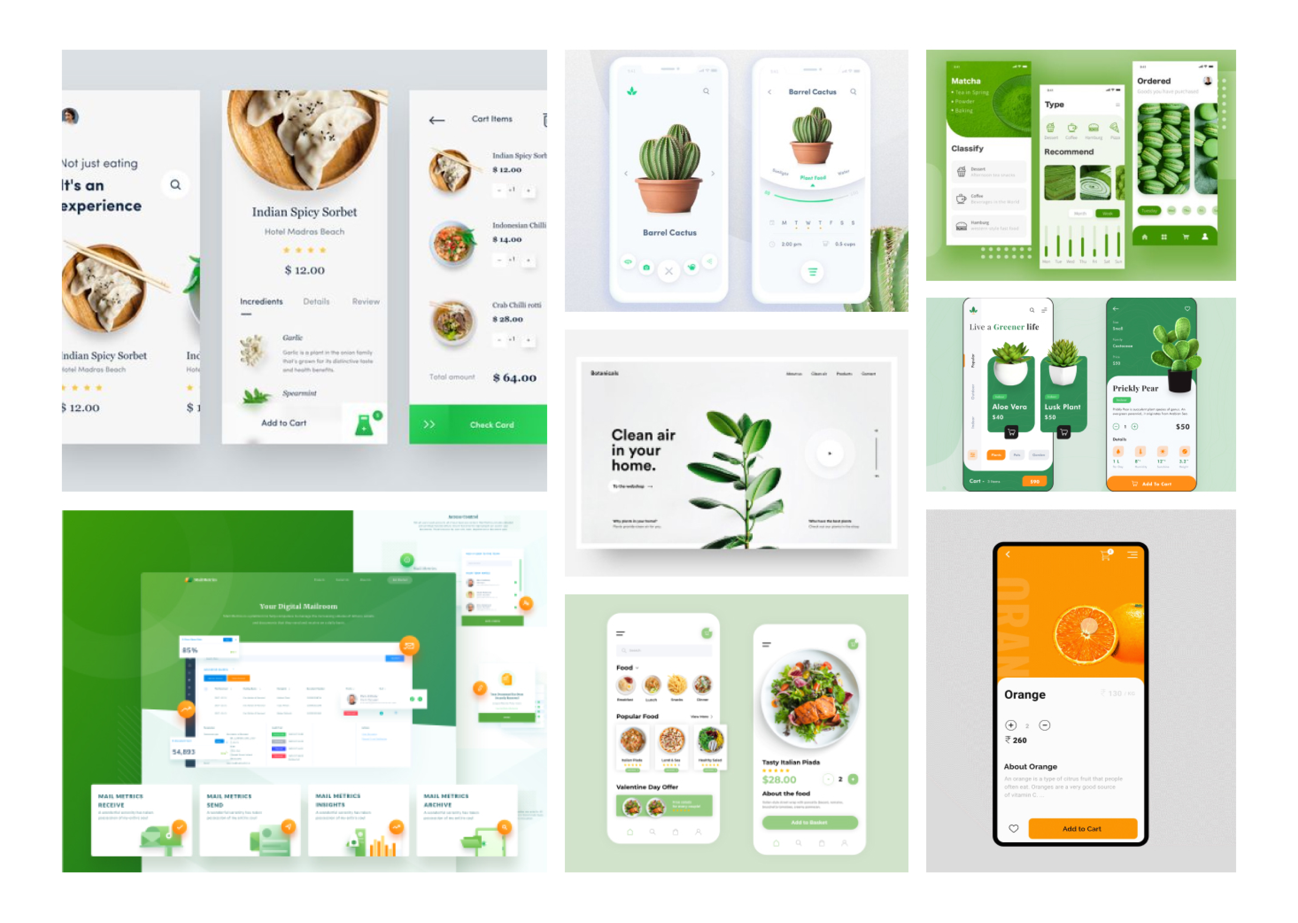
The design exploration should help to develop a matching visual design for our final app. Our approach was to start very open-mindedly and free. We developed two different moodboards, styleguides and first visual screen designs independent of one another. In retrospect, we discussed both approaches, took the best elements of each other, and combined it into a final design direction.
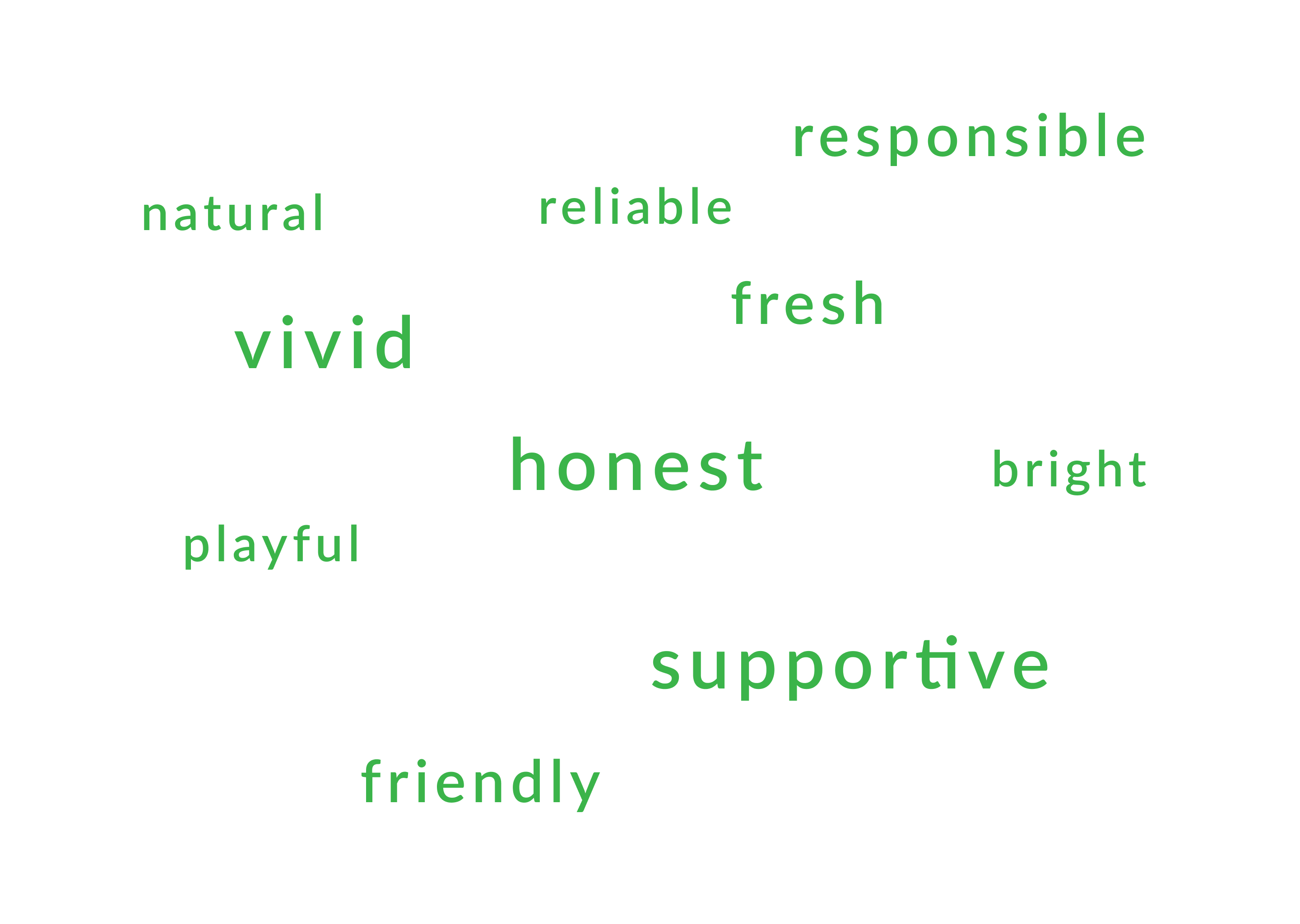
Approach Julia
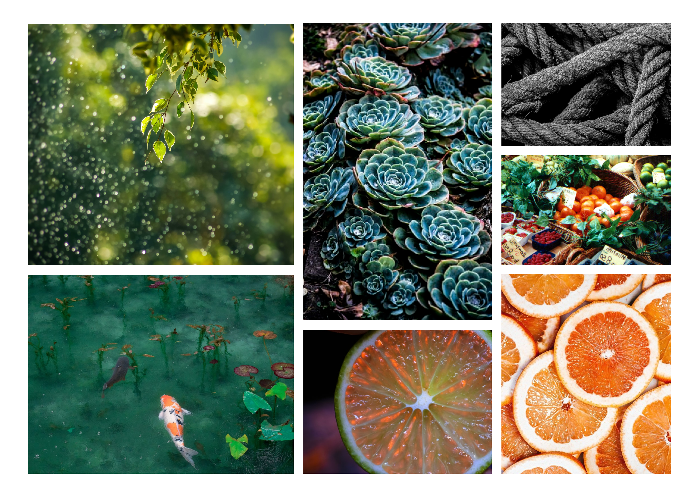
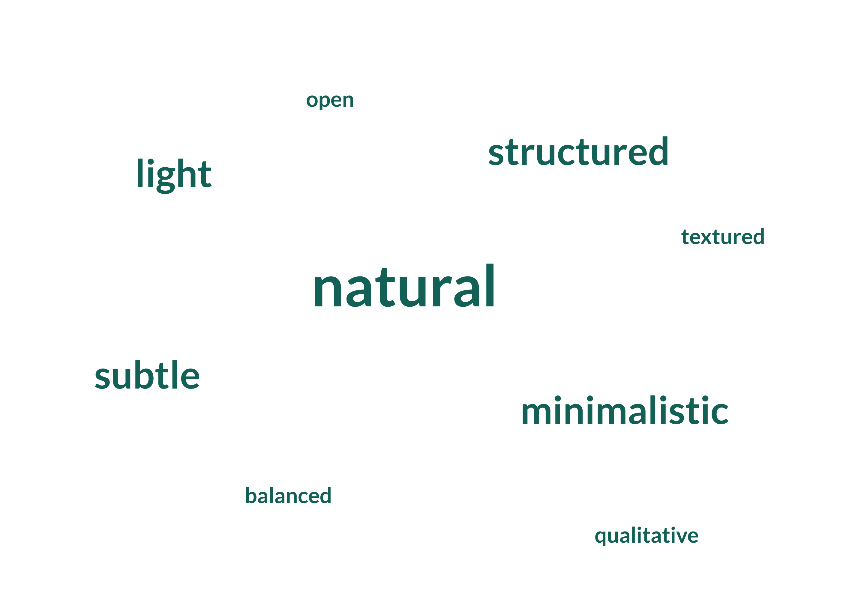
Approach Joe
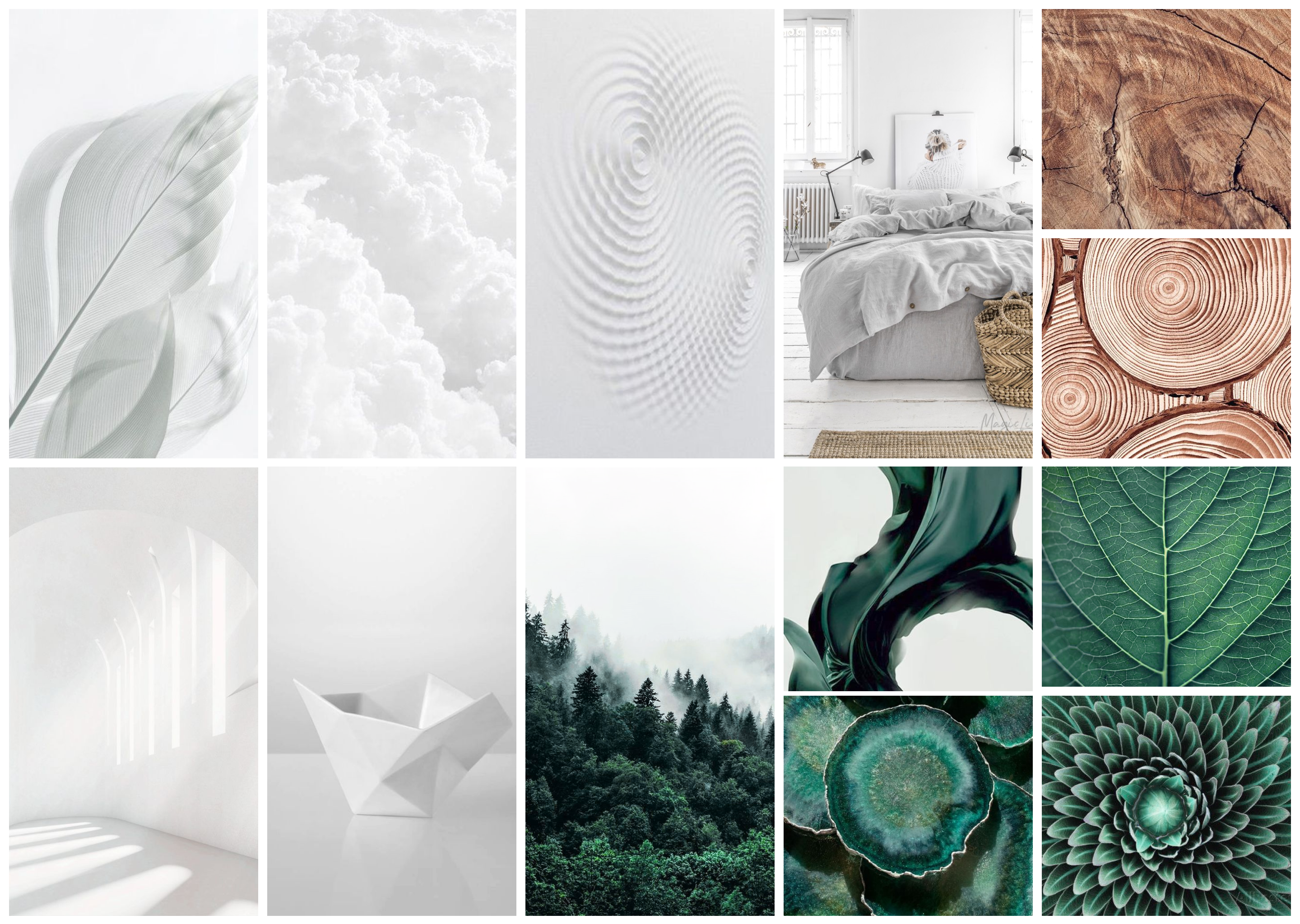
Combined Moodboard
Screendesign Julia
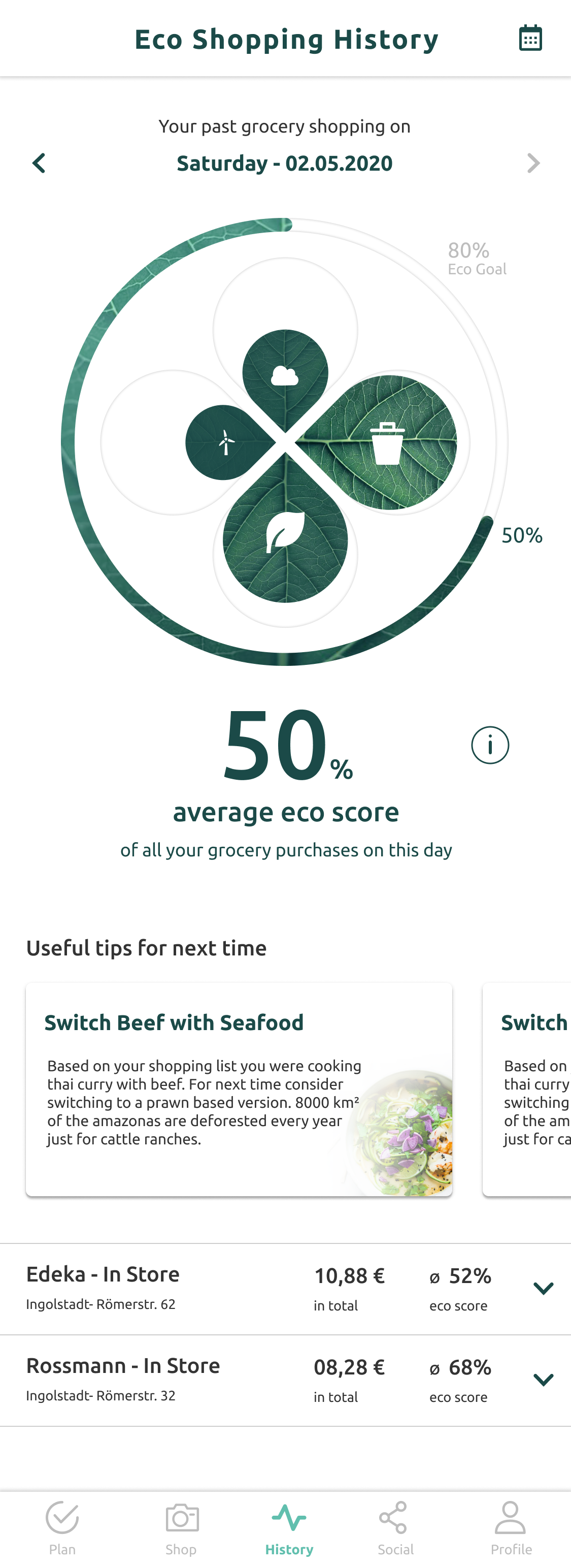
Screendesign Joe
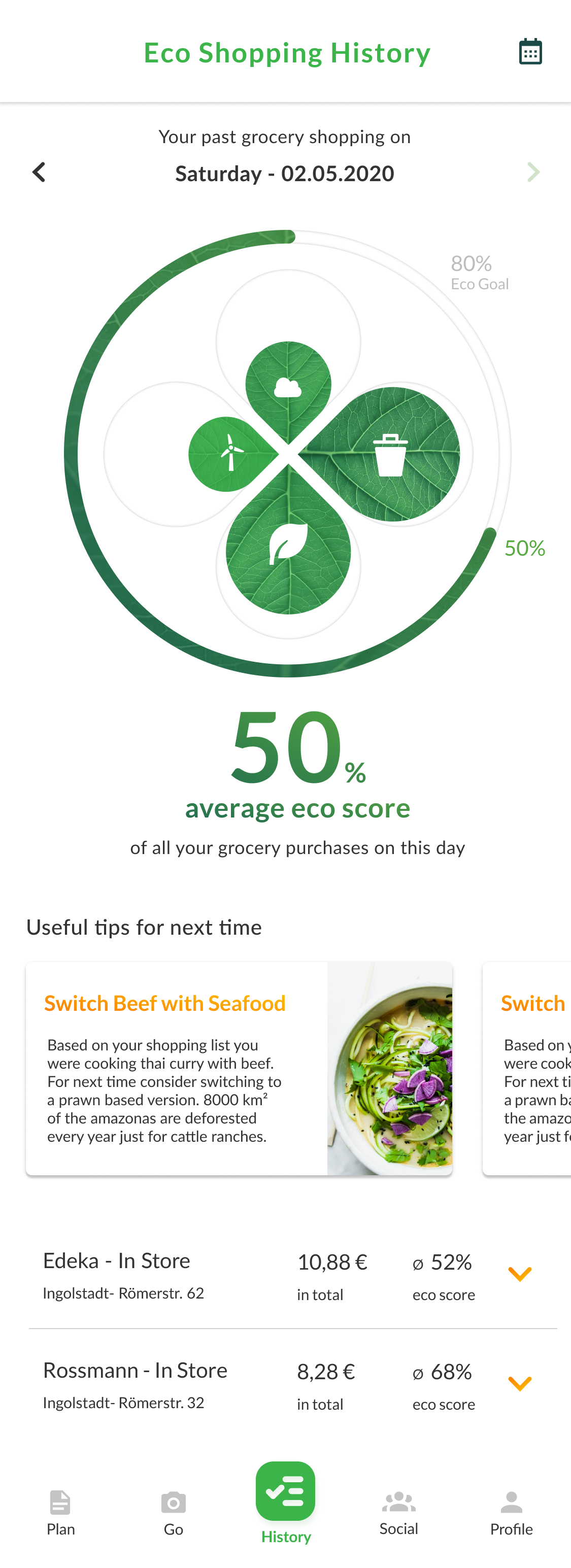
Combined Screendesign
Putting it together
Final Visual Design
10 Visual Design
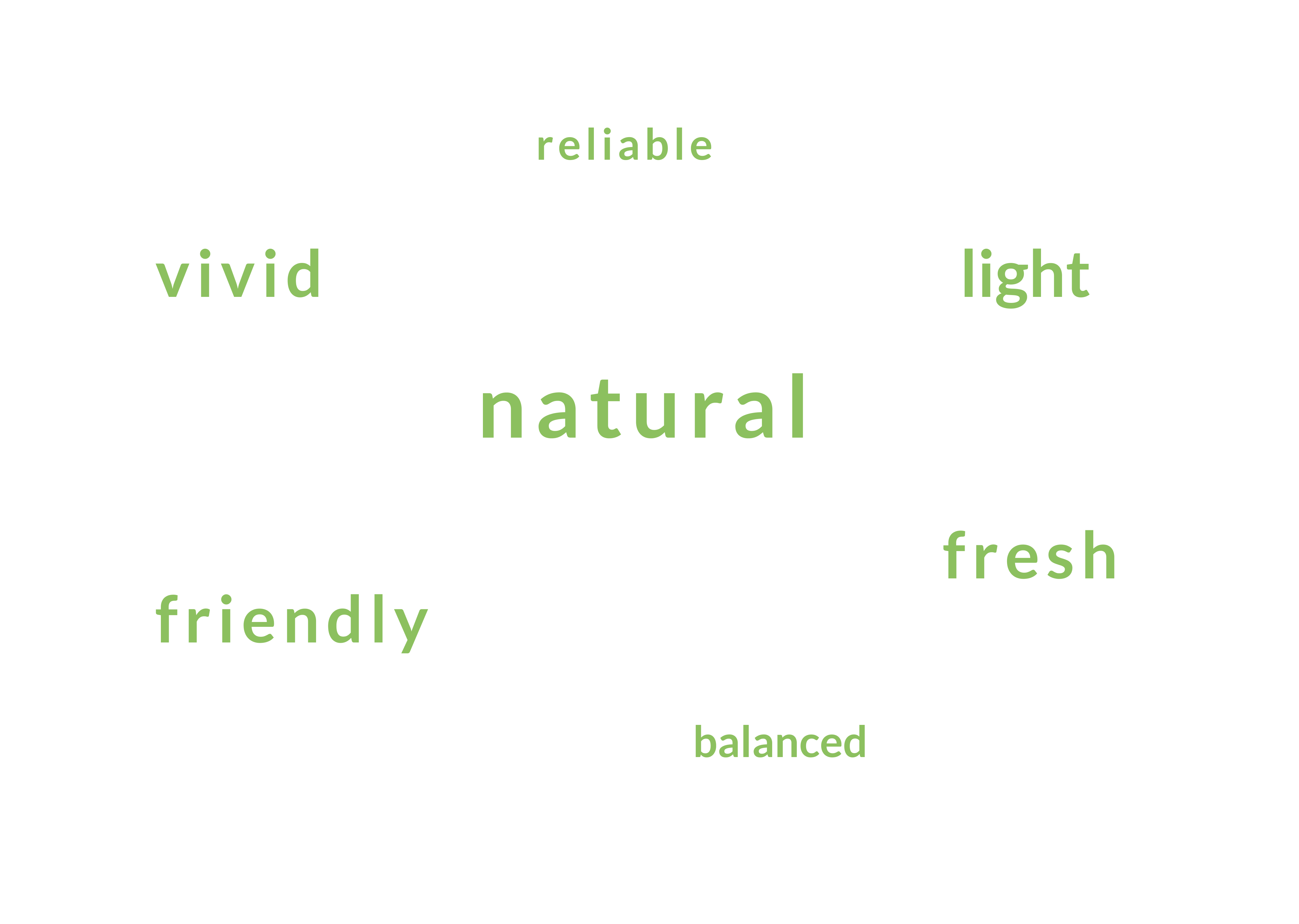
The final visual screen design was mostly done by my teampartner Julia - She did a great job! The design of the app should give the feeling of lightness and balance but also appear vivid and fresh. The dominant colors are a fresh green and subtle whites. The orange works as a highlighting accent color. Following some selected visuals in no particular order.
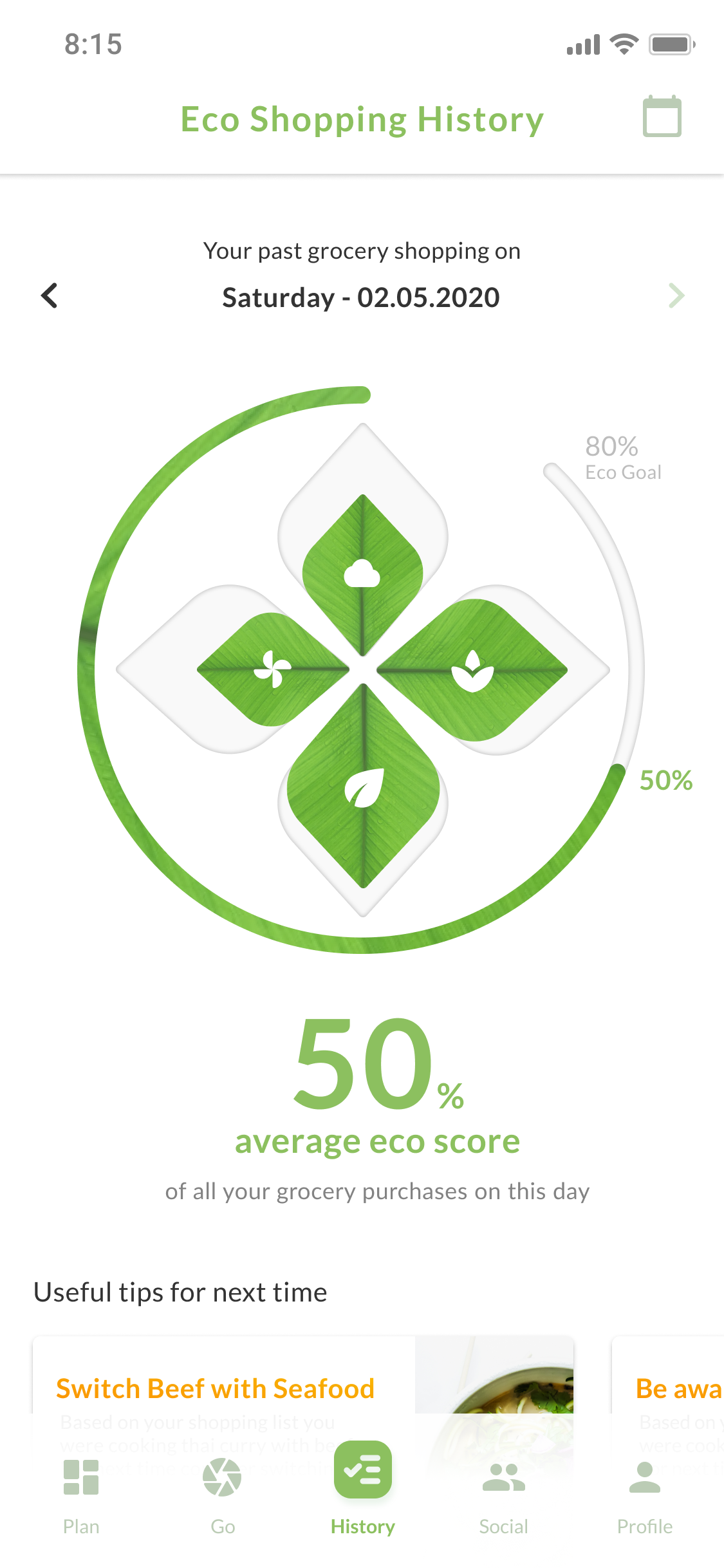
Eco History
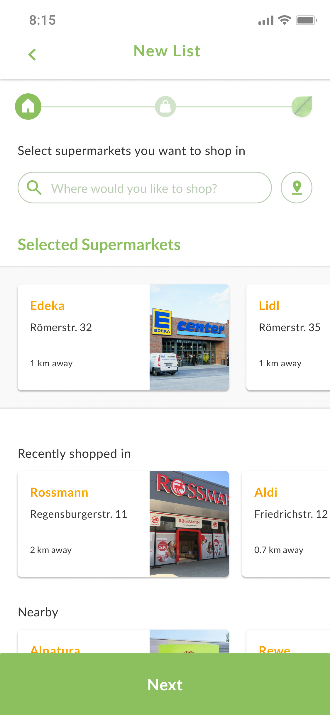
Create New List
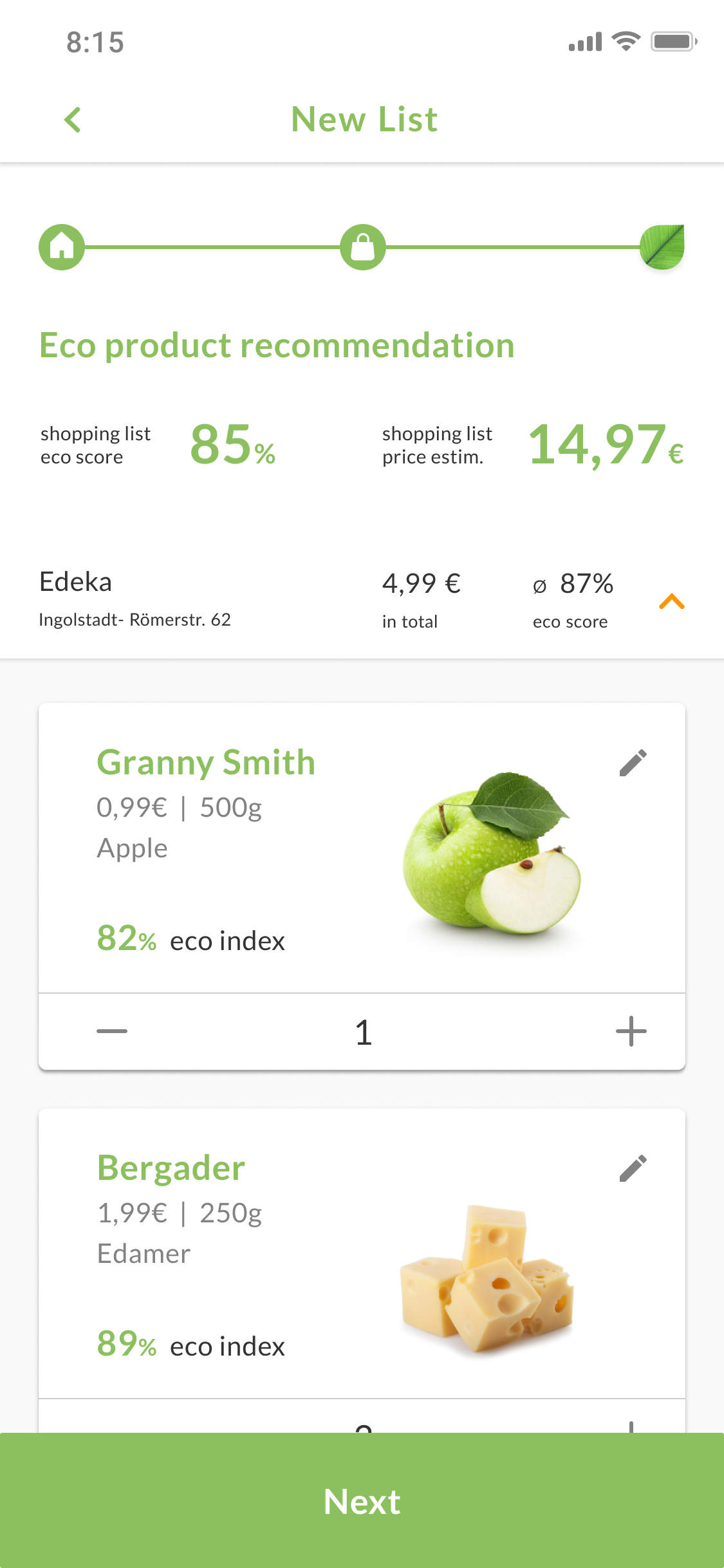
Eco recommendation
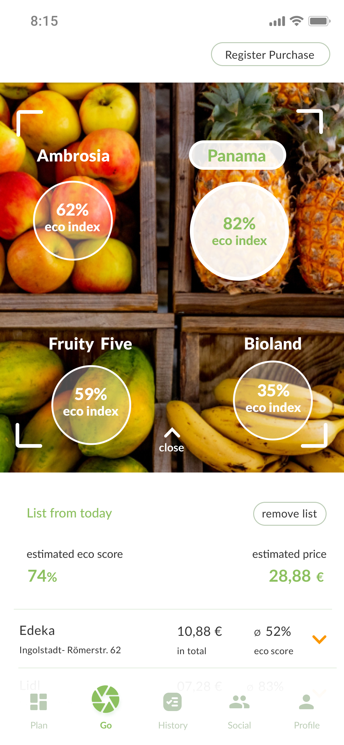
Eco Quick Comparison
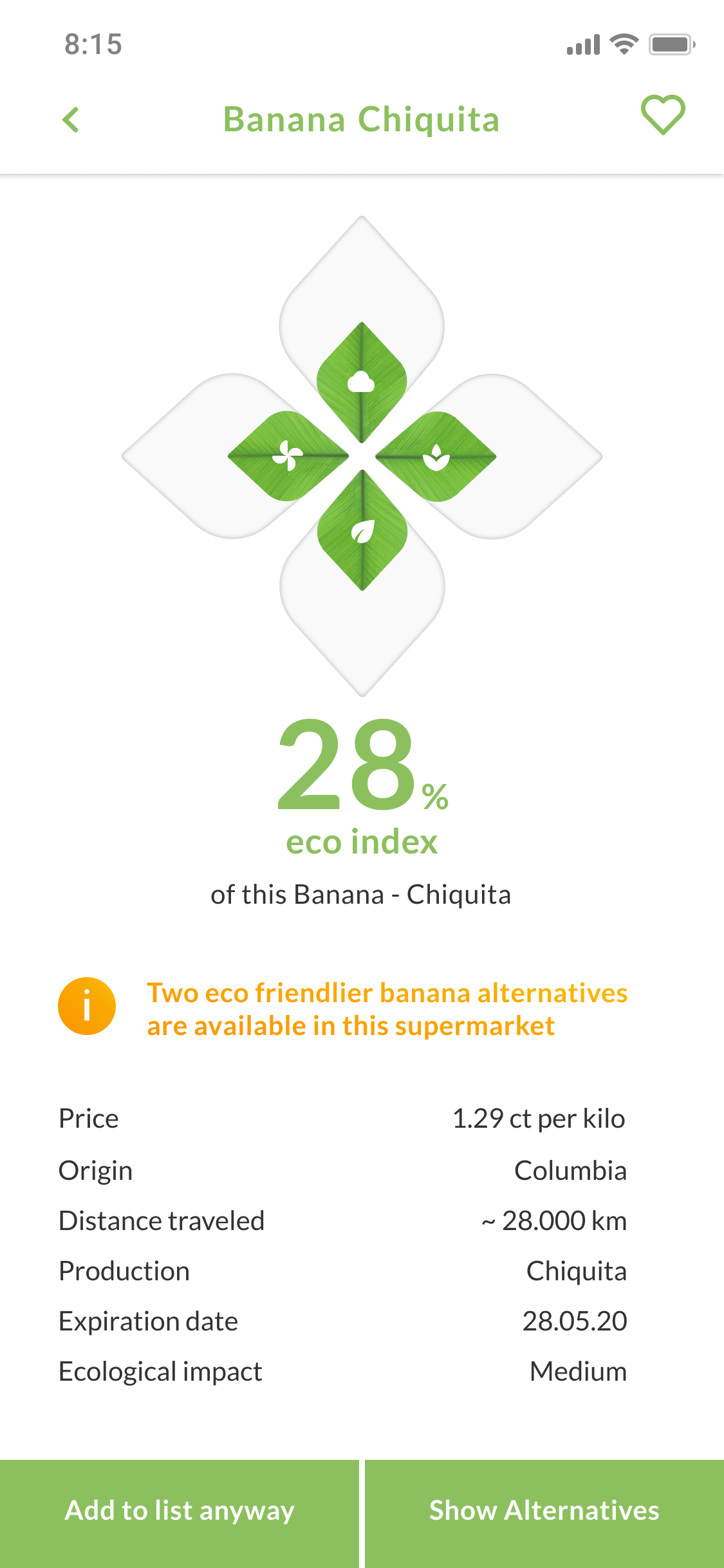
Eco Product Characteristics
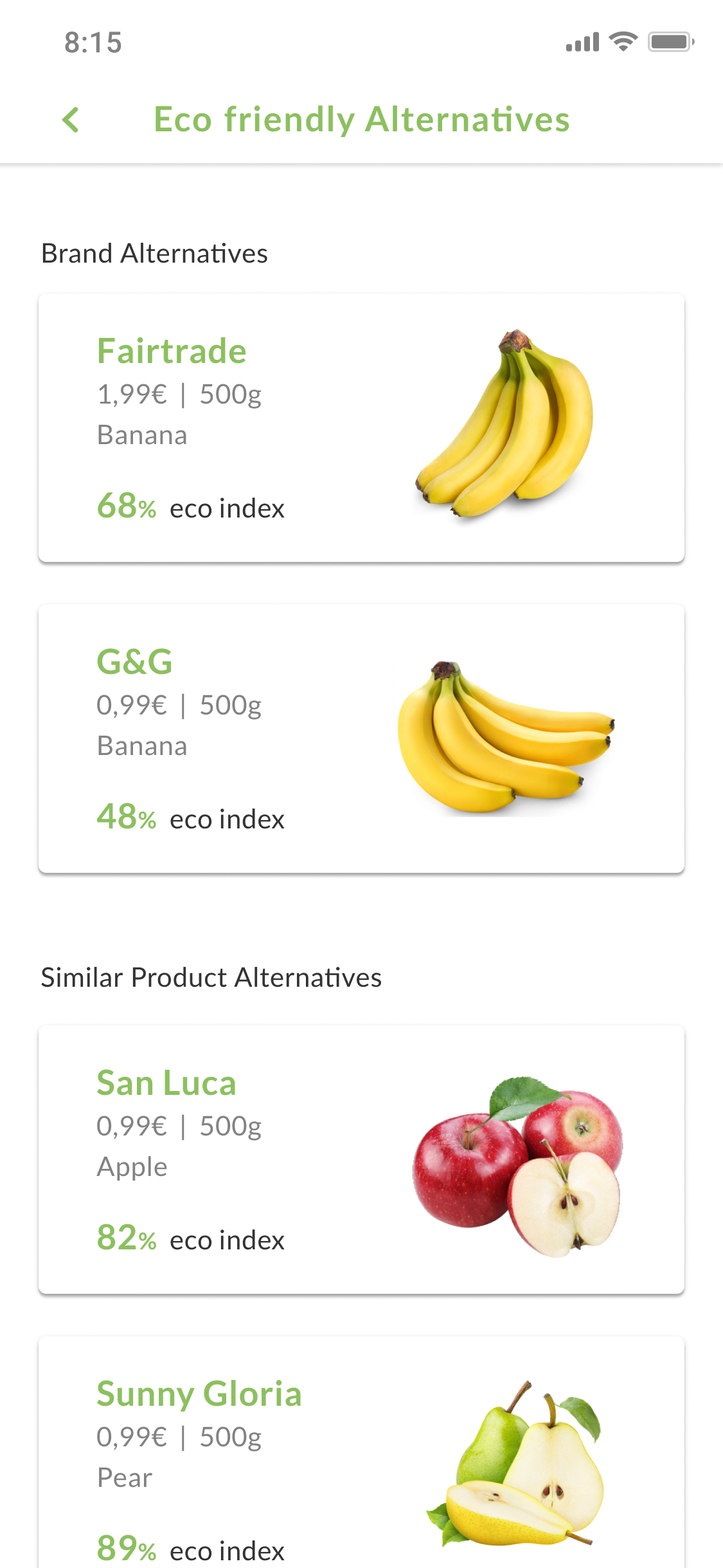
Eco Alternatives
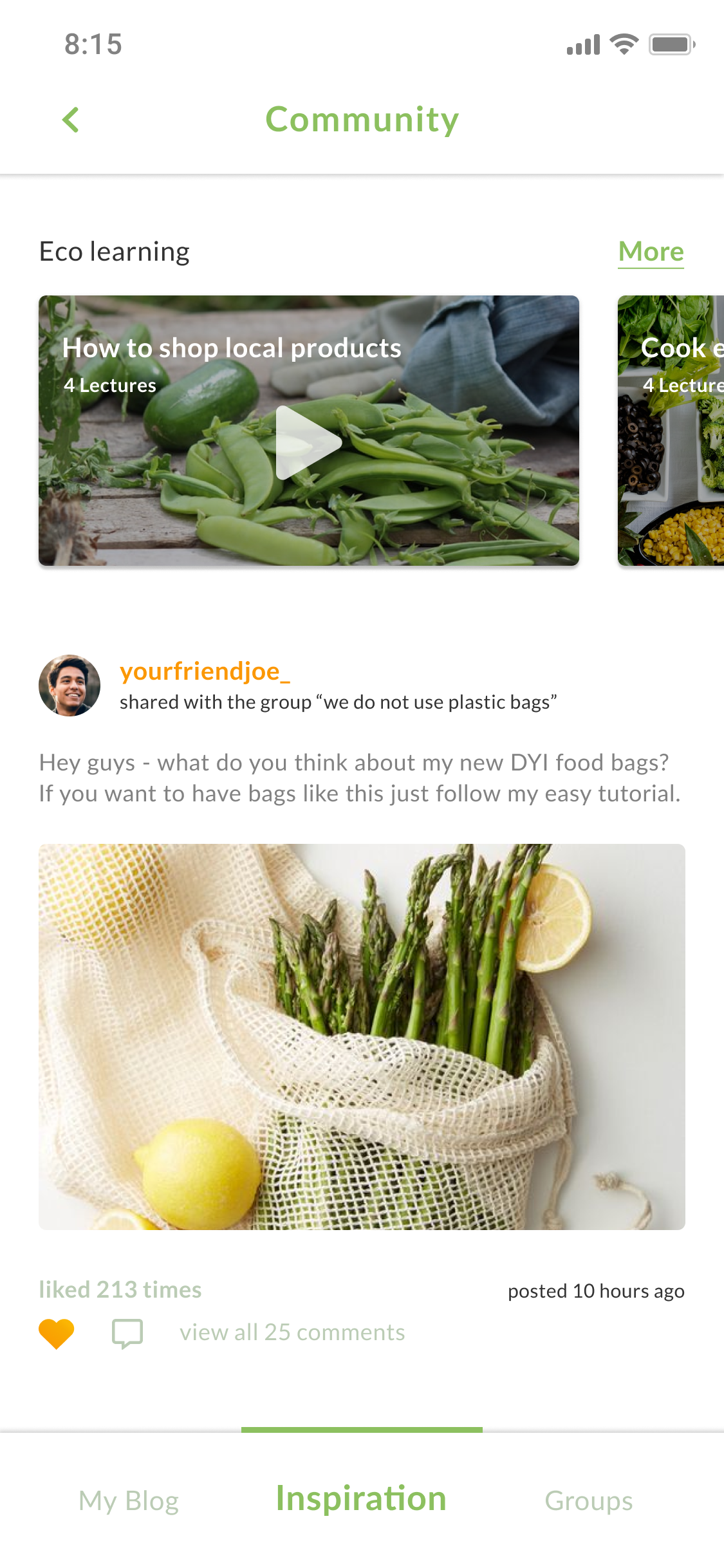
Eco Community - Inspiration
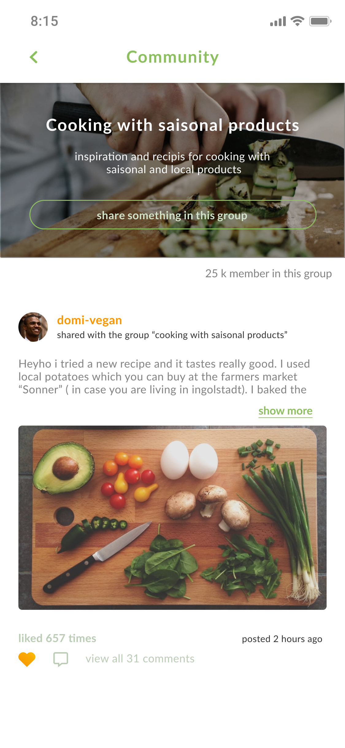
Eco Community - Group
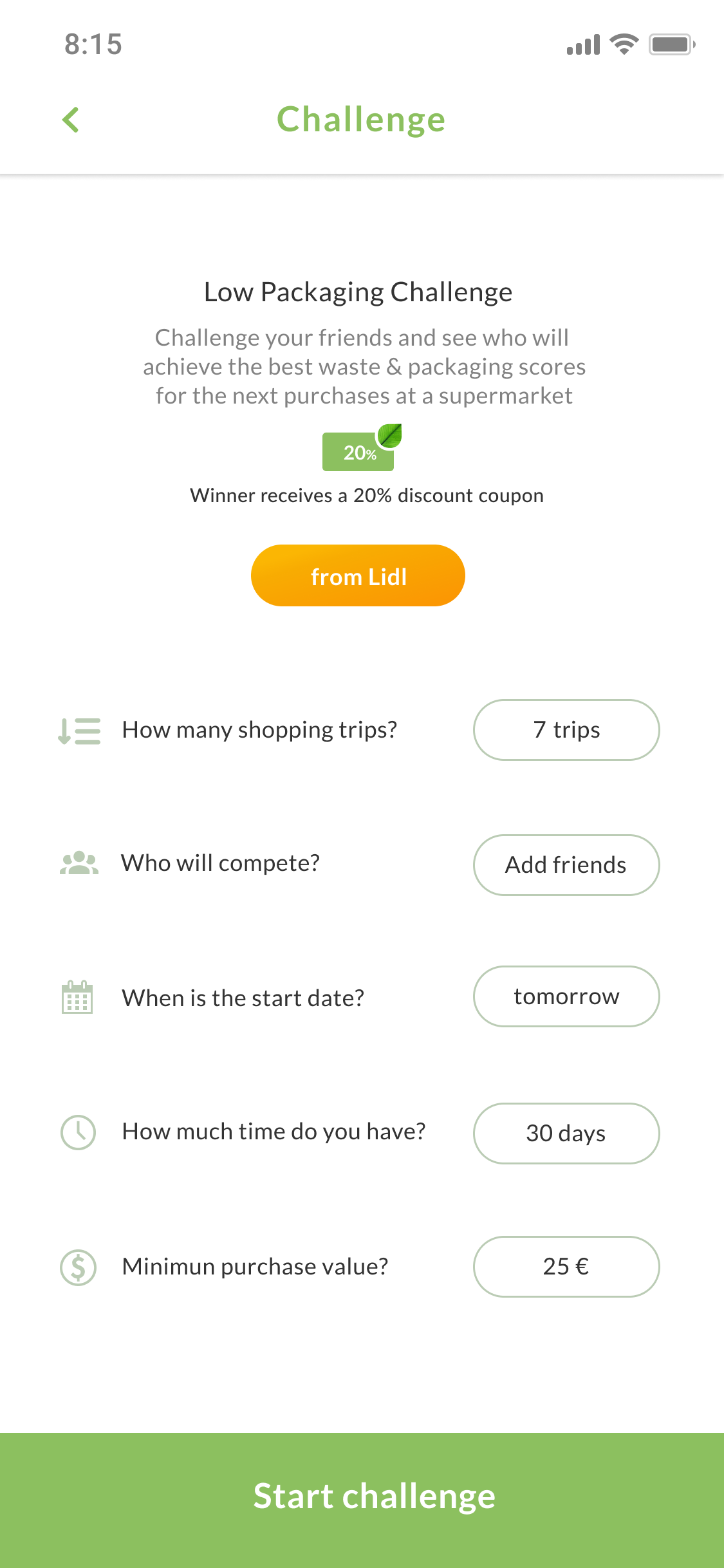
Eco Shopping Challenges
Some Motion for Emotion
Spielberg would be proud… I guess
11 Motion Design
To bring our eco concept to life, we then decided to create some animations for the most interesting features within our eco app. Additionally, we created a promotional video in Adobe After Effects (video on top). The focus for us was not to simply show our concept, but rather emotionally tell the story on how our eco concept can help every single one of us to make the first step into a brighter and more ecological future.
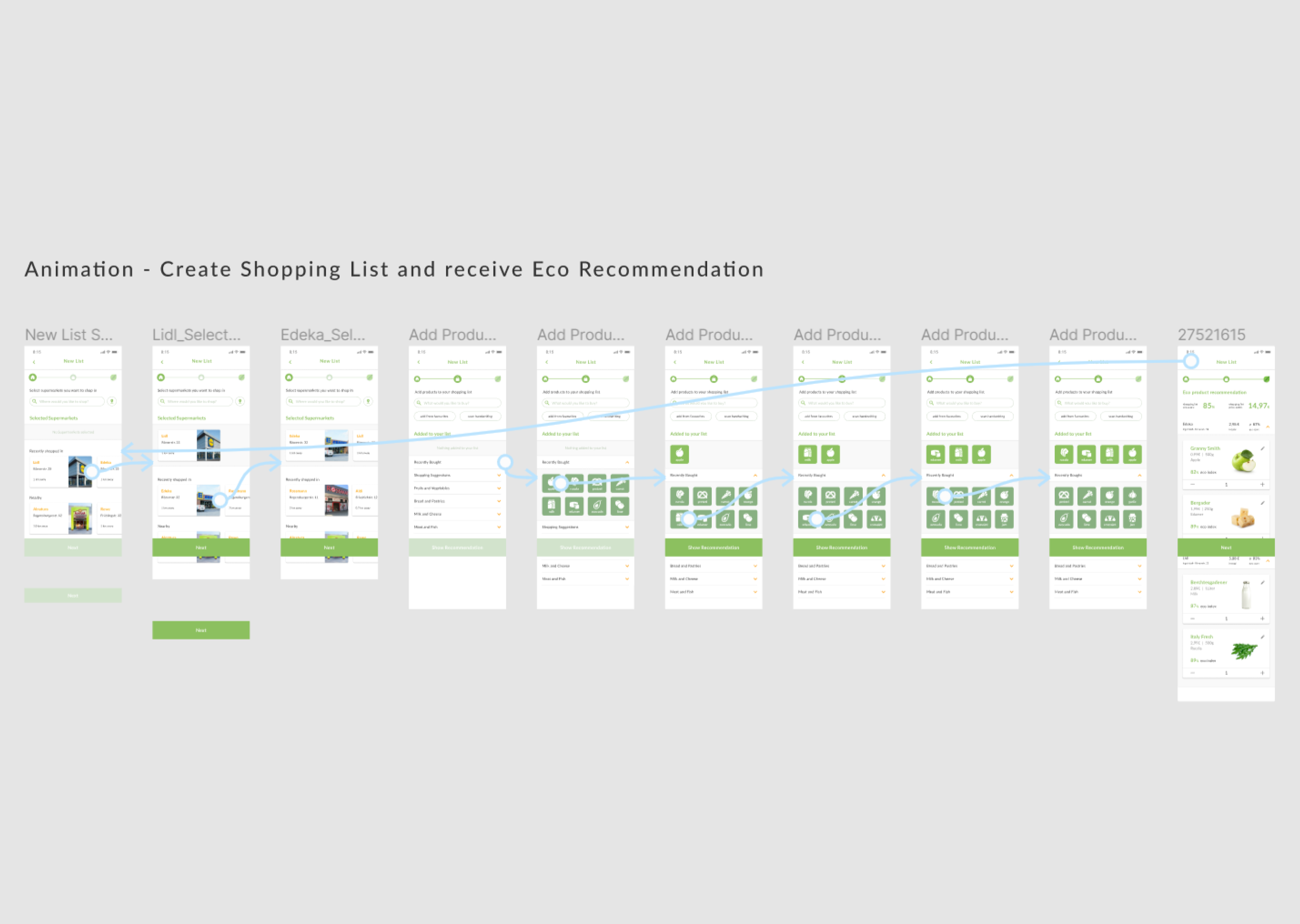
Animations and Transitions created in Figma
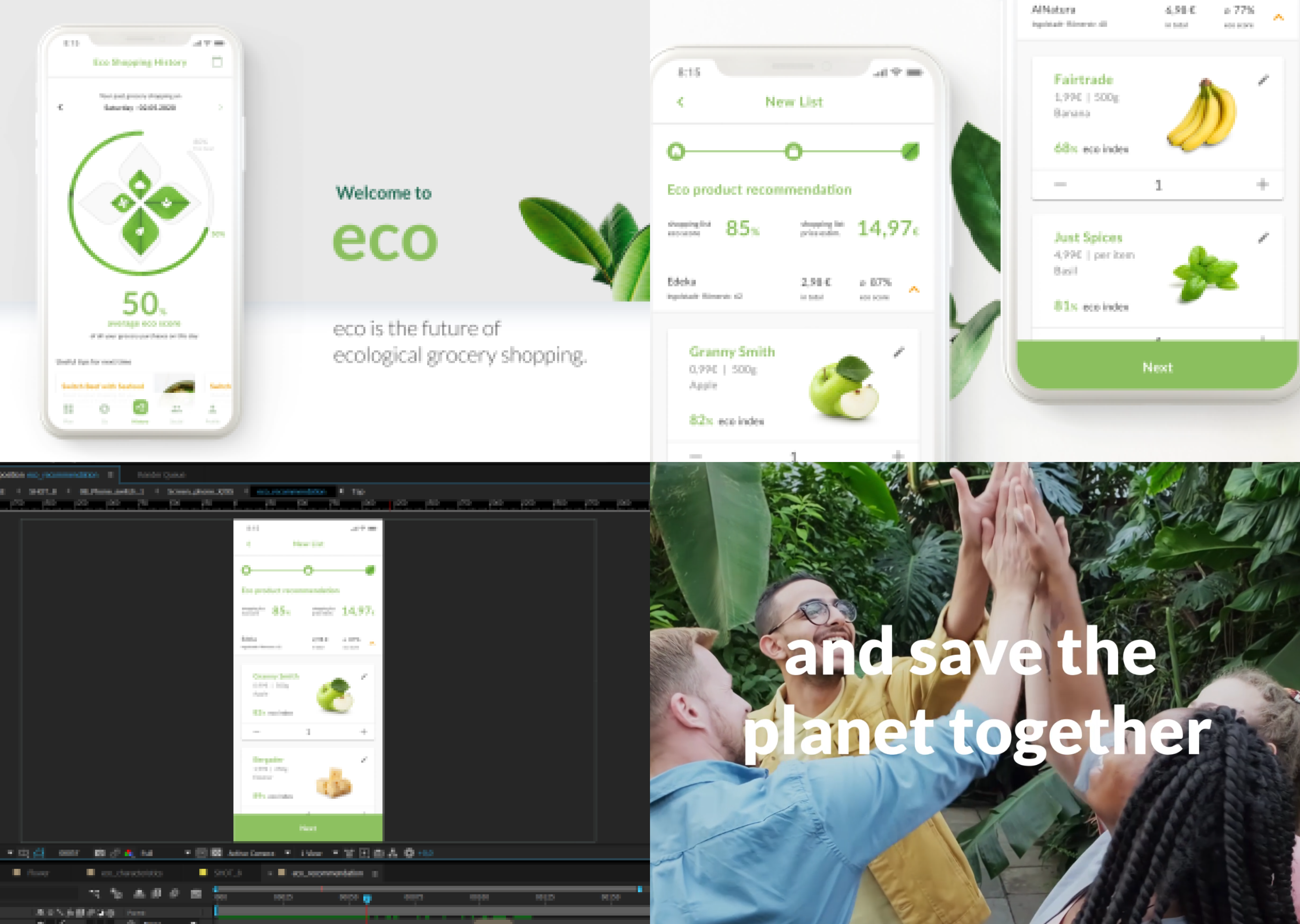
Promotional Video created in After Effects
Align your work
with your life purpose
12 Lessons learned
This project has taught me how extremely motivating it is to work on a topic that deeply aligns with my understanding of the future world we should create. Developing this concept is definitely something that I am proud of. Additionally, because of the 2020 lockdown situation, I learned how to work and design completely remotely together in a team. A huge shoutout again to Julia. Thank you for the great teamwork and your dedication to our concept, I enjoyed and appreciated it a lot 😊
Still curious?
Check out some of my other projects
Entertainment experiences for autonomous driving
Audi entertain vision - case study
During my last semester, I got the chance to write my bachelor thesis in cooperation with Audi's HMI team including UX research, UX design, visual design, prototyping and Unity development.
BACHELOR THESIS • 24 WEEKS • JAN 2019 • READING TIME 8 MIN
An approach to an all in one travel companion
Tripster - case study
I developed a concept for a mobile application, The goal was to enhance the trip experience by providing personalized travel sight and event recommendations. This project includes mainly UX research, UX design, and visual design.
PERSONAL PROJECT • 4 WEEKS • OCT 2019 • READING TIME 10 MIN